# dialog_hub
**Repository Path**: penll/dialog_hub
## Basic Information
- **Project Name**: dialog_hub
- **Description**: 1、极简链式调用:类 ArkTS 的流畅 API 设计,通过链式调用(如 .setStyle().setObserveData().build().show())快速配置,开发者只需关注自身逻辑,无需处理冗余模板代码;2、状态管理:内置 ObservedV2 双向绑定,自动响应数据变化更新弹窗内容,支持动态观测(observe)外部数据源;3、高定制化能力
- **Primary Language**: Unknown
- **License**: Not specified
- **Default Branch**: master
- **Homepage**: None
- **GVP Project**: No
## Statistics
- **Stars**: 1
- **Forks**: 0
- **Created**: 2025-07-17
- **Last Updated**: 2025-11-10
## Categories & Tags
**Categories**: Uncategorized
**Tags**: None
## README
# @pll/dialog_hub (API12 - 5.0.0)
## ☀简介
[@pll/dialog_hub]()
基于 ComponentV2 + ObservedV2 状态管理的弹窗。一款极易上手的通用弹窗。
1. 极简链式调用:类 ArkTS 的流畅 API 设计,通过链式调用(如
.style\(\).observeData\(\).build\(\).show\(\))快速配置,开发者只需关注自身逻辑,无需处理冗余模板代码;
2. 状态管理:内置 ObservedV2 双向绑定,自动响应数据变化更新弹窗内容,支持动态观测(observe)外部数据源;
3. 高定制化能力:样式定制,支持全局预设样式。同时style样式与弹窗配置解耦。使用".style\(templateStyle\)"可直接配置自定义模板;
覆盖任意 UI 细节;内容扩展,支持插入自定义组件(attach 挂件)、wrapperBuilder、contentBuilder,适配复杂业务场景;
4. 开箱即用功能:预设常见弹窗类型,一键调用。满足不同场景下的的开发弹窗需求。
5. 增加多个实用额外功能,如onDidDisappear((reason) =>void) 返回关闭原因,方便使用者针对关闭原因做不同处理。
## 💻下载安装
`ohpm i @pll/dialog_hub`
## 📚API详解
| DialogHub方法 | 介绍 |
|:-------------------|:--------------------------------------------------------|
| init | 设置默认统一样式 |
| getConfirm | 【系统弹窗】显示操作确认类弹窗(这边结合系统Confirm和alert两种弹窗。内部可配置对应显示对应弹窗) |
| getTips | 【系统弹窗】显示提示弹窗,即为带图形确认弹窗 |
| getSelect | 【系统弹窗】显示选择类弹窗 |
| getToast | 【系统弹窗】显示吐司 |
| showToast | 【系统弹窗】显示吐司,等同getToast,即静态方法,无需链式调用 |
| getTextInput | 显示单行文本输入弹窗 |
| getTextArea | 显示多行文本输入弹窗 |
| getCustom | 显示自定义内容区弹窗,支持自定义底部按钮区域、标题区域、支持自定义背景图(这些区域支持预设样式) |
| getActionSheet | 显示动作面板(IOS风格) |
| getTextPicker | 显示选择器弹窗;入参参考TextPicker组件;支持自定义底部复选框标题区域(这些区域支持预设样式) |
| getDatePicker | 显示日期选择器弹窗,支持自定义底部复选框标题区域(这些区域支持预设样式) |
| getGuide | 显示功能引导弹窗,支持指定目标组件 ID,自动绘制目标区域高亮,并可设置引导内容,引导内容默认目标下发,可定制 |
| getLoading | 显示加载中弹窗,支持动态刷新内容 |
| static showLoading | 支持静态方法调用的loading DialogHub.showLoading\(\) |
| getLoadingProgress | 显示进度条加载弹窗,支持动态刷新进度和内容 |
| getToastIcon | 显示带图形的吐司,支持图标与文字可垂直、水平排列 |
| getImage | 显示纯图片弹窗,默认支持底部关闭挂件 |
| isShowing | 当前弹窗是否显示 |
| closeDialog | 关闭弹窗 |
| generateId | 生成弹窗id |
## 📚如何上手 [使用案例]()
### 一个简单demo
```ts
// 底部滑出弹窗
DialogHub.getCustom()
.alignment(DialogAlignment.Bottom)
.customContent(() => {//支持builder和wrapperBuilder
this.customContentDemo1Builder()
})
.style({ //自定义样式 可自行封装为模板
borderRadius: { topLeft: 20, topRight: 20 },
width: '100%',
padding: 0
})
.buttons([
{
// customStyleId: "confirmBtnStyle", // 可直设置预设样式(预设样式可在init时设置)
fontColor: '#FF191F25',
fontSize: 17,
value: '取消',
},
{
fontColor: '#50AB00',
fontSize: 17,
value: '确认',
}
])
// .attaches([PresetAttach.insideTopRightClose], (i) => { // 可设置自定义的挂件 或 dialog_hub提供的预设挂件
// this.toast(`点击了第${i}个挂件`)
// })
.onDidDisappear((reason) => {// 关闭弹窗 支持获取关闭原因
if (reason === CloseReason.ACTION) {
console.log('点击action')
} else {
console.log('点击取消、遮罩等')
}
})
.onAction((index: number) => {
this.toast(`点击了第${index}个按钮`)
})
.build({
// build内可设置 全量参数。支持系统弹窗所有参数,即:promptAction.BaseDialogOptions
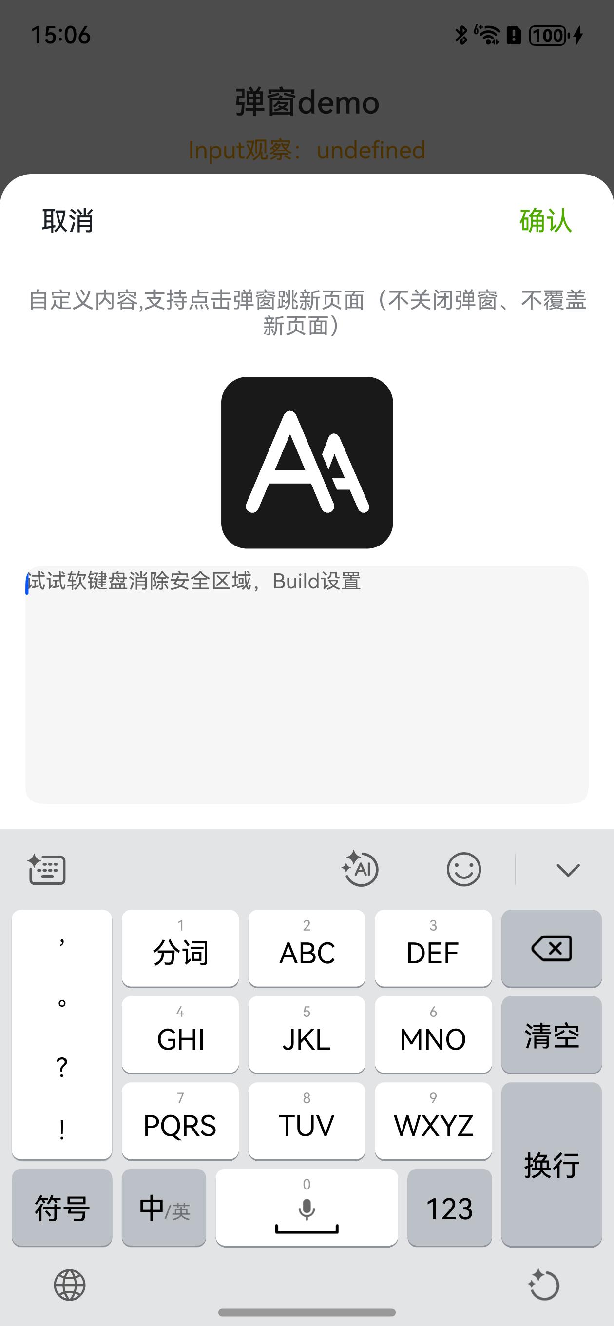
// 下面是设置消除软键盘把弹窗顶起中间的空白区域
keyboardAvoidDistance: LengthMetrics.vp(0)// 消除软键盘把弹窗顶起中间的空白区域
})
.show()
```
| 底部滑出 | 输入消除安全区域 |
|:--------------------------------------------------------------------------------------------------------------------------------------------------------|:--------------------------------------------------------------------------------------------------------------------------------------------------------|
|  |
|  |
### 接下来是初始化
```ts
//方式1:简单初始化 使用默认配置
DialogHub.init((config) => {
config.uiAbilityContext = this.context;
})
```
```ts
//方式2:使用自定义配置
DialogHub.init((config) => {
// ------------ 弹窗通用样式 ------------
config.maxWidth = 300 //弹窗最大宽度
config.width = 280
config.borderRadius = 20 //弹窗 圆角
config.maskColor = 'rgba(0, 0, 0, 0.7)' //背景遮罩颜色覆盖
// ------------ 组件样式 ------------
//设置文本选择器样式
config.pickerSpecifyOptions.style.divider = { color: $r('app.color.border_line2') } //分割线样式
config.pickerSpecifyOptions.canLoop = false
config.pickerSpecifyOptions.style.buttonFontColorPrimary = '#FF191F25'
config.pickerSpecifyOptions.style.buttonFontColorSecondary =
$r('app.color.link_or_confirm_text') //picker 确定按钮统一颜色
// 设置动作弹窗样式(需要时设置)
//config.bottomActionSheetSpecifyOptions = new BottomActionSheetSpecifyOptions();
// 设置加载弹窗样式(需要时设置)
//config.loadingSpecifyOptions = new LoadingSpecifyOptions();
// 设置选择器弹窗样式(需要时设置)
//config.pickerSpecifyOptions = new PickerSpecifyOptions();
// 设置吐司样式(需要时设置)
//config.toastSpecifyOptions = new ToastSpecifyOptions();
// 设置 自定义挂件
config.attaches = new Map([
[DialogPresetStyle.insideTopRightYellowCloseAttach,
{
alignRules: AlignTopRight,
image: $r('app.media.base_close_btn_orange'),
width: 16,
height: 16,
markAnchor: {
x: 8,
y: -25
}
} as IPresetAttachImage],
])
//设置自定义的预设样式(目前支持自定义标题、自定义按钮区域。内容自定义请结合自定义内容弹窗一起可实现)
config.customStyles = [{
customStyleId: DialogPresetStyle.confirmBtn, //设置 样式 ID
background: $r('app.color.primary_color'),
borderRadius: 20,
fontColor: Color.White,
fontSize: 15,
fontWeight: FontWeight.Medium,
height: 36,
layoutWeight: 1,
}];
});
```
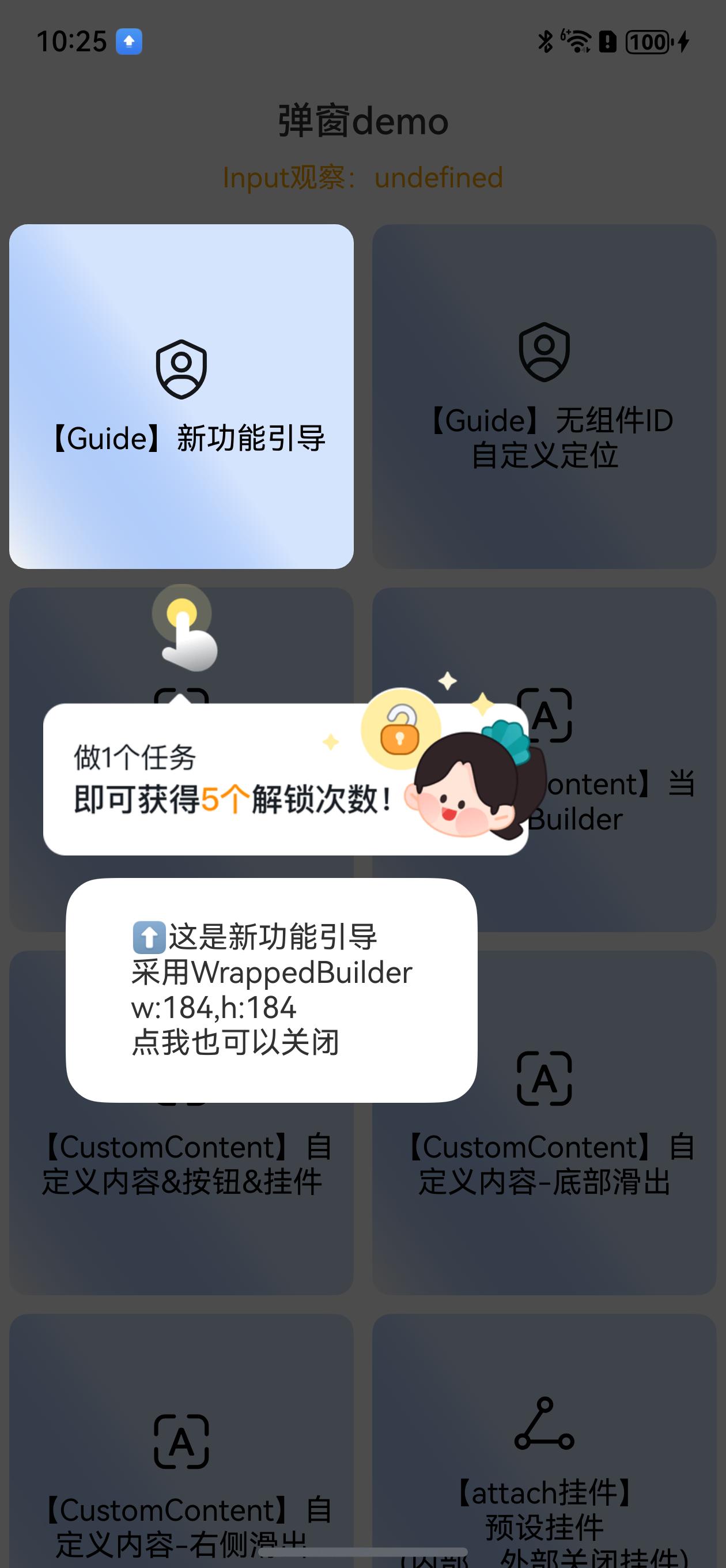
#### 功能引导弹窗
```ts
// 【Guide】功能引导弹窗
DialogHub.getGuide()
.target({
id: 'guideComponent', //指定ID 能自动识别区域高亮
}, 10)
.customContent({
// 方式1、使用全局WrappedBuilder(推荐)
contentBuilder: GuideDemoContentBuilder.getBuilder() as WrappedBuilder<[IGuideContentParams]>,//详细见entry示例
// 方式2、使用内置自定义组件方式(须消除内置样式,builder非全局;好处是无需构造WrappedBuilder)
// contentBuilder: {
// localizedContentAreaPadding: {
// //⚠️注意:内置样式 - 自定义内容组件会自带内边距24vp,这边须覆盖系统预设样式
// top: LengthMetrics.vp(20),
// bottom: LengthMetrics.vp(0),
// start: LengthMetrics.vp(20),
// end: LengthMetrics.vp(0),
// },
// contentBuilder: () => {
// this.customGuideBuilder(guide.getOptions().targetPositionOptions as IGuideTarget) // 获取高亮区域信息 - 详细见entry示例
// }
// },
})
.onAction(() => {
this.toast('点击了引导区域')
})
.build()
.show()
```
引导指定组件效果:
|
### 接下来是初始化
```ts
//方式1:简单初始化 使用默认配置
DialogHub.init((config) => {
config.uiAbilityContext = this.context;
})
```
```ts
//方式2:使用自定义配置
DialogHub.init((config) => {
// ------------ 弹窗通用样式 ------------
config.maxWidth = 300 //弹窗最大宽度
config.width = 280
config.borderRadius = 20 //弹窗 圆角
config.maskColor = 'rgba(0, 0, 0, 0.7)' //背景遮罩颜色覆盖
// ------------ 组件样式 ------------
//设置文本选择器样式
config.pickerSpecifyOptions.style.divider = { color: $r('app.color.border_line2') } //分割线样式
config.pickerSpecifyOptions.canLoop = false
config.pickerSpecifyOptions.style.buttonFontColorPrimary = '#FF191F25'
config.pickerSpecifyOptions.style.buttonFontColorSecondary =
$r('app.color.link_or_confirm_text') //picker 确定按钮统一颜色
// 设置动作弹窗样式(需要时设置)
//config.bottomActionSheetSpecifyOptions = new BottomActionSheetSpecifyOptions();
// 设置加载弹窗样式(需要时设置)
//config.loadingSpecifyOptions = new LoadingSpecifyOptions();
// 设置选择器弹窗样式(需要时设置)
//config.pickerSpecifyOptions = new PickerSpecifyOptions();
// 设置吐司样式(需要时设置)
//config.toastSpecifyOptions = new ToastSpecifyOptions();
// 设置 自定义挂件
config.attaches = new Map([
[DialogPresetStyle.insideTopRightYellowCloseAttach,
{
alignRules: AlignTopRight,
image: $r('app.media.base_close_btn_orange'),
width: 16,
height: 16,
markAnchor: {
x: 8,
y: -25
}
} as IPresetAttachImage],
])
//设置自定义的预设样式(目前支持自定义标题、自定义按钮区域。内容自定义请结合自定义内容弹窗一起可实现)
config.customStyles = [{
customStyleId: DialogPresetStyle.confirmBtn, //设置 样式 ID
background: $r('app.color.primary_color'),
borderRadius: 20,
fontColor: Color.White,
fontSize: 15,
fontWeight: FontWeight.Medium,
height: 36,
layoutWeight: 1,
}];
});
```
#### 功能引导弹窗
```ts
// 【Guide】功能引导弹窗
DialogHub.getGuide()
.target({
id: 'guideComponent', //指定ID 能自动识别区域高亮
}, 10)
.customContent({
// 方式1、使用全局WrappedBuilder(推荐)
contentBuilder: GuideDemoContentBuilder.getBuilder() as WrappedBuilder<[IGuideContentParams]>,//详细见entry示例
// 方式2、使用内置自定义组件方式(须消除内置样式,builder非全局;好处是无需构造WrappedBuilder)
// contentBuilder: {
// localizedContentAreaPadding: {
// //⚠️注意:内置样式 - 自定义内容组件会自带内边距24vp,这边须覆盖系统预设样式
// top: LengthMetrics.vp(20),
// bottom: LengthMetrics.vp(0),
// start: LengthMetrics.vp(20),
// end: LengthMetrics.vp(0),
// },
// contentBuilder: () => {
// this.customGuideBuilder(guide.getOptions().targetPositionOptions as IGuideTarget) // 获取高亮区域信息 - 详细见entry示例
// }
// },
})
.onAction(() => {
this.toast('点击了引导区域')
})
.build()
.show()
```
引导指定组件效果:
 ```ts
// 【Guide】无指定组件ID 自定义定位
DialogHub.getGuide()
.customContent({
// builder内设置postion定位
contentBuilder: GuideImageDemoContentBuilder.getBuilder() as WrappedBuilder<[object]>,//详细见entry示例
})
.build()
.show()
```
无指定组件效果:
```ts
// 【Guide】无指定组件ID 自定义定位
DialogHub.getGuide()
.customContent({
// builder内设置postion定位
contentBuilder: GuideImageDemoContentBuilder.getBuilder() as WrappedBuilder<[object]>,//详细见entry示例
})
.build()
.show()
```
无指定组件效果:
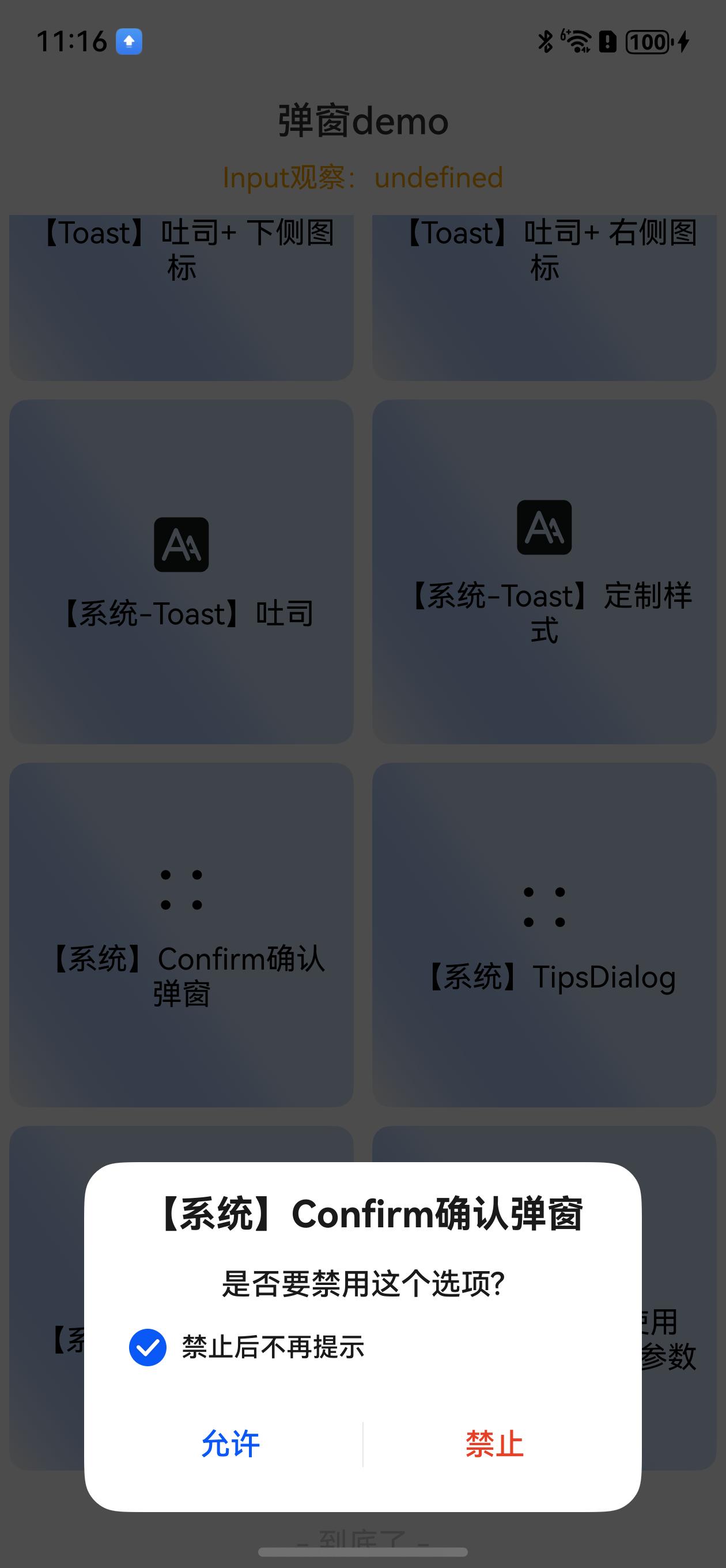
 #### 【系统】确认弹窗
```ts
//【系统】ConfirmDialog确认弹窗 (这边结合系统Confirm和alert两种弹窗。内部可配置对应显示对应弹窗)
DialogHub.getConfirm()
.autoCancel(false)
.alignment(DialogAlignment.Bottom)
.buttons({
value: '允许',
action: () => {
this.toast('允许')
},
}, {
value: '禁止',
role: ButtonRole.ERROR,
action: () => {
this.toast('操作成功')
}
})
.check(true, (checked: boolean) => {
this.toast('勾选:' + checked)
}, '禁止后不再提示')
.title('【系统】Confirm确认弹窗')
.content('是否要禁用这个选项?')
.build({
markAnchor: { y: 30 }, // 弹窗底部弹出,设置底部安全区域偏移
})
.show()
```
确认弹窗效果(可居中也可底部,效果为底部):
#### 【系统】确认弹窗
```ts
//【系统】ConfirmDialog确认弹窗 (这边结合系统Confirm和alert两种弹窗。内部可配置对应显示对应弹窗)
DialogHub.getConfirm()
.autoCancel(false)
.alignment(DialogAlignment.Bottom)
.buttons({
value: '允许',
action: () => {
this.toast('允许')
},
}, {
value: '禁止',
role: ButtonRole.ERROR,
action: () => {
this.toast('操作成功')
}
})
.check(true, (checked: boolean) => {
this.toast('勾选:' + checked)
}, '禁止后不再提示')
.title('【系统】Confirm确认弹窗')
.content('是否要禁用这个选项?')
.build({
markAnchor: { y: 30 }, // 弹窗底部弹出,设置底部安全区域偏移
})
.show()
```
确认弹窗效果(可居中也可底部,效果为底部):
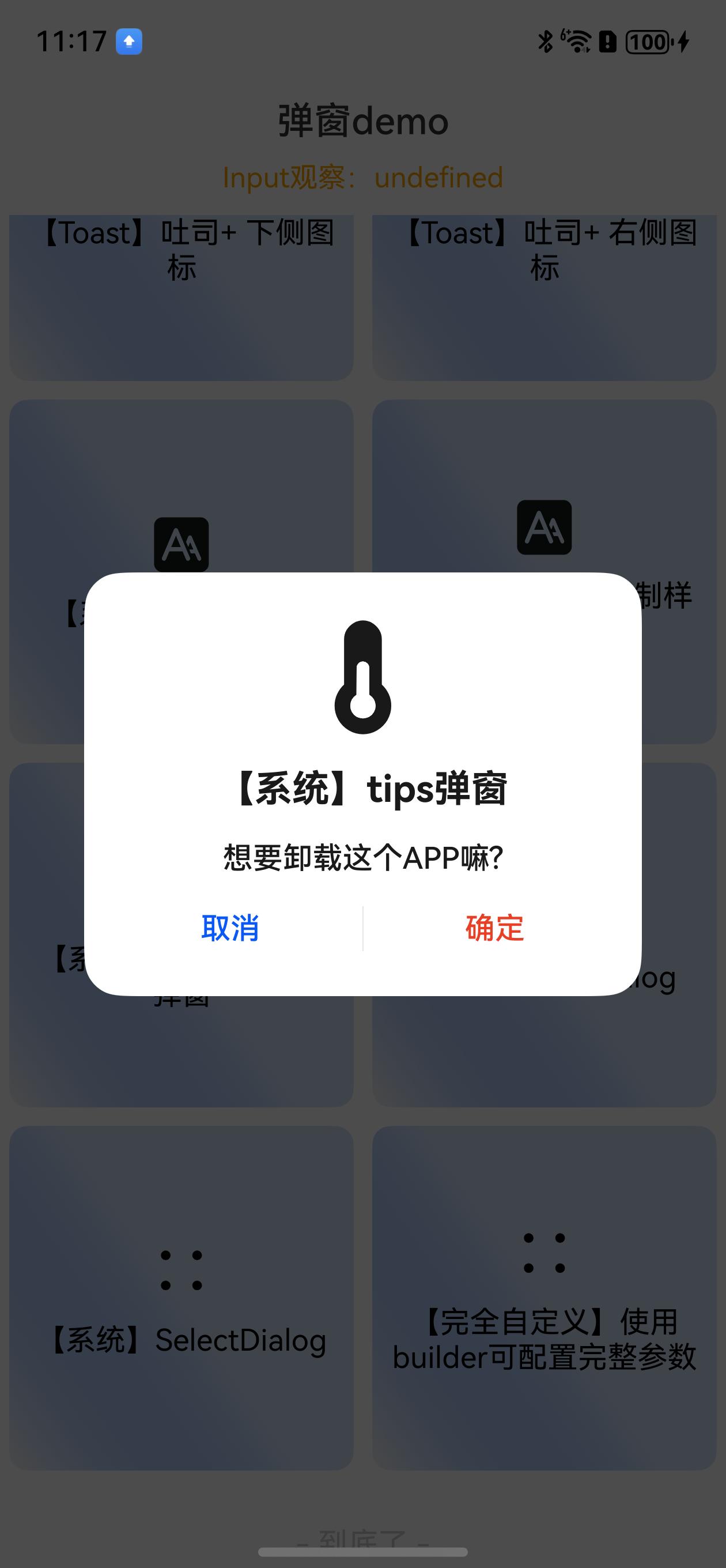
 ```ts
//【系统】TipsDialog
DialogHub.getTips()
.title('【系统】tips弹窗')
.content('想要卸载这个APP嘛?')
.imageRes($r('sys.media.thermometer_fill'))
.buttons(
{
value: '取消',
action: () => {
this.toast('取消')
},
},
{
value: '确定',
role: ButtonRole.ERROR,
action: () => {
this.toast('确定')
},
})
.build()
.show()
```
TipsDialog弹窗效果:
```ts
//【系统】TipsDialog
DialogHub.getTips()
.title('【系统】tips弹窗')
.content('想要卸载这个APP嘛?')
.imageRes($r('sys.media.thermometer_fill'))
.buttons(
{
value: '取消',
action: () => {
this.toast('取消')
},
},
{
value: '确定',
role: ButtonRole.ERROR,
action: () => {
this.toast('确定')
},
})
.build()
.show()
```
TipsDialog弹窗效果:
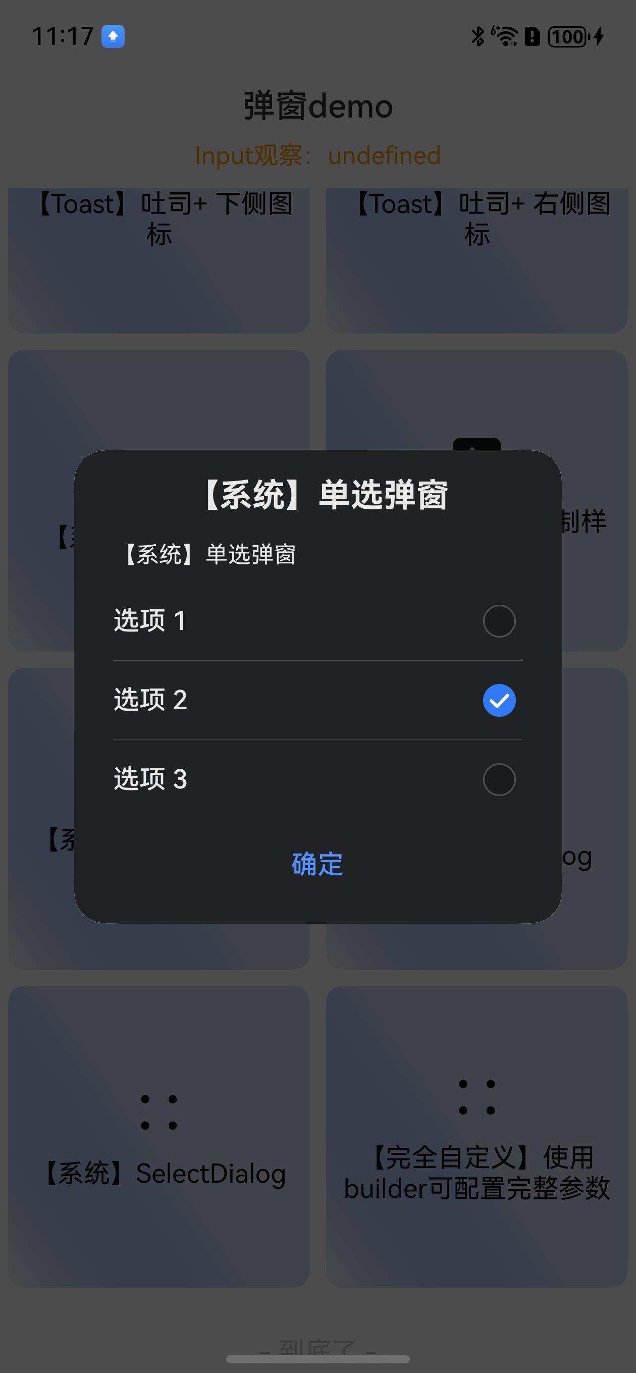
 ```ts
//【系统】SelectDialog
DialogHub.getSelect('【系统】单选弹窗',
{
value: '确定',
action: () => {
DialogHub.closeDialog()
}
},
[
{
title: '选项 1',
icon: $r('sys.media.ohos_ic_public_edit'),
action: () => {
this.toast('选项 1')
}
},
{
title: '选项 2',
action: () => {
this.toast('选项 2')
}
},
{
title: '选项 3',
action: () => {
this.toast('选项 3')
}
},
])
.content('【系统】单选弹窗')
.selectedIndex(1)
.themeColorMode(ThemeColorMode.DARK)//仅系统弹窗支持设置
.build()
.show()
```
SelectDialog弹窗效果:
```ts
//【系统】SelectDialog
DialogHub.getSelect('【系统】单选弹窗',
{
value: '确定',
action: () => {
DialogHub.closeDialog()
}
},
[
{
title: '选项 1',
icon: $r('sys.media.ohos_ic_public_edit'),
action: () => {
this.toast('选项 1')
}
},
{
title: '选项 2',
action: () => {
this.toast('选项 2')
}
},
{
title: '选项 3',
action: () => {
this.toast('选项 3')
}
},
])
.content('【系统】单选弹窗')
.selectedIndex(1)
.themeColorMode(ThemeColorMode.DARK)//仅系统弹窗支持设置
.build()
.show()
```
SelectDialog弹窗效果:
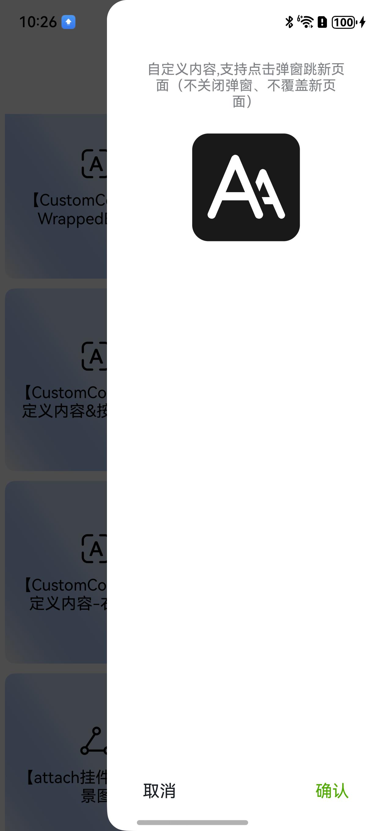
 ```ts
// 【CustomContent】WrappedBuilder 自定义内容弹窗
DialogHub.getCustom()
.customContent(CustomContentDemoContentBuilder.getBuilder() as WrappedBuilder<[object]>)//详细见entry示例
.style({
borderRadius: 20,
customHeader: {
customStyleId: 'commonTitleStyle'
}
})
.build()
.show()
// 【CustomContent】当前页Builder
DialogHub.getCustom()
.autoCancel(false)
.customContent(() => {
this.customTextBuilder("我是一个自定义文本内的弹框!\n\n 点击我关闭")//详细见entry示例
})
.build()
.show()
```
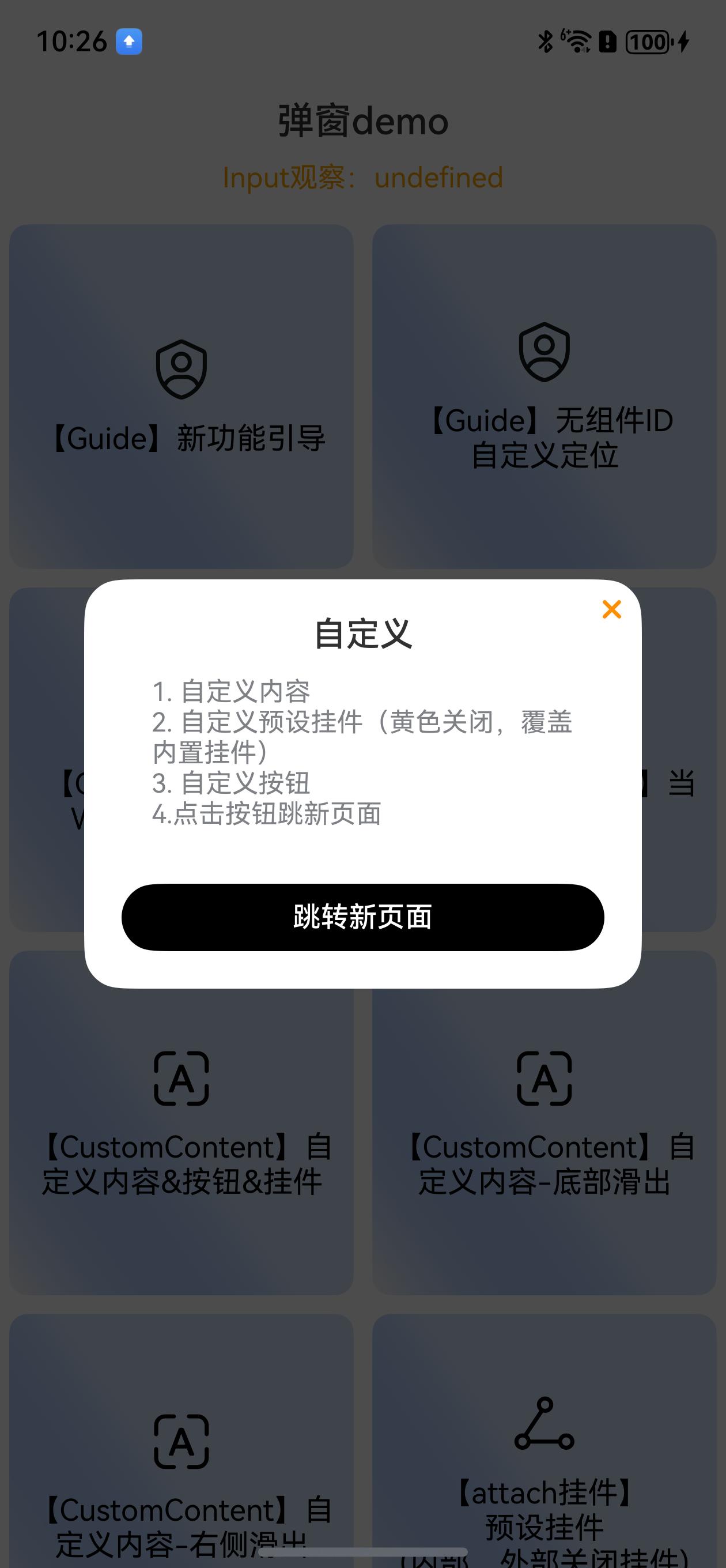
#### 自定义内容
```ts
// 【CustomContent】自定义内容&按钮
DialogHub.getCustom()
.dialogId('custom1111')
.autoCancel(false)
.actionCancel(false)
.customContent(() => {
this.customContent1111Builder()//详细见entry示例
})
.style({
borderRadius: 20,
customHeader: {
customStyleId: 'commonTitleStyle'
},
padding: 20,
})
.title('自定义')
.attaches([DialogPresetStyle.insideTopRightYellowCloseAttach], (i) => {
DialogHub.closeDialog('custom1111')
})
.buttons([
{
customStyleId: "confirmBtnStyle",
fontColor: Color.White,
value: '跳转新页面',
action: () => {
new Router().pushUrl({
url: 'pages/Page1',
})
},
width: 200
}
])
.build()
.show()
```
自定义内容+按钮弹窗效果:
```ts
// 【CustomContent】WrappedBuilder 自定义内容弹窗
DialogHub.getCustom()
.customContent(CustomContentDemoContentBuilder.getBuilder() as WrappedBuilder<[object]>)//详细见entry示例
.style({
borderRadius: 20,
customHeader: {
customStyleId: 'commonTitleStyle'
}
})
.build()
.show()
// 【CustomContent】当前页Builder
DialogHub.getCustom()
.autoCancel(false)
.customContent(() => {
this.customTextBuilder("我是一个自定义文本内的弹框!\n\n 点击我关闭")//详细见entry示例
})
.build()
.show()
```
#### 自定义内容
```ts
// 【CustomContent】自定义内容&按钮
DialogHub.getCustom()
.dialogId('custom1111')
.autoCancel(false)
.actionCancel(false)
.customContent(() => {
this.customContent1111Builder()//详细见entry示例
})
.style({
borderRadius: 20,
customHeader: {
customStyleId: 'commonTitleStyle'
},
padding: 20,
})
.title('自定义')
.attaches([DialogPresetStyle.insideTopRightYellowCloseAttach], (i) => {
DialogHub.closeDialog('custom1111')
})
.buttons([
{
customStyleId: "confirmBtnStyle",
fontColor: Color.White,
value: '跳转新页面',
action: () => {
new Router().pushUrl({
url: 'pages/Page1',
})
},
width: 200
}
])
.build()
.show()
```
自定义内容+按钮弹窗效果:
 ```ts
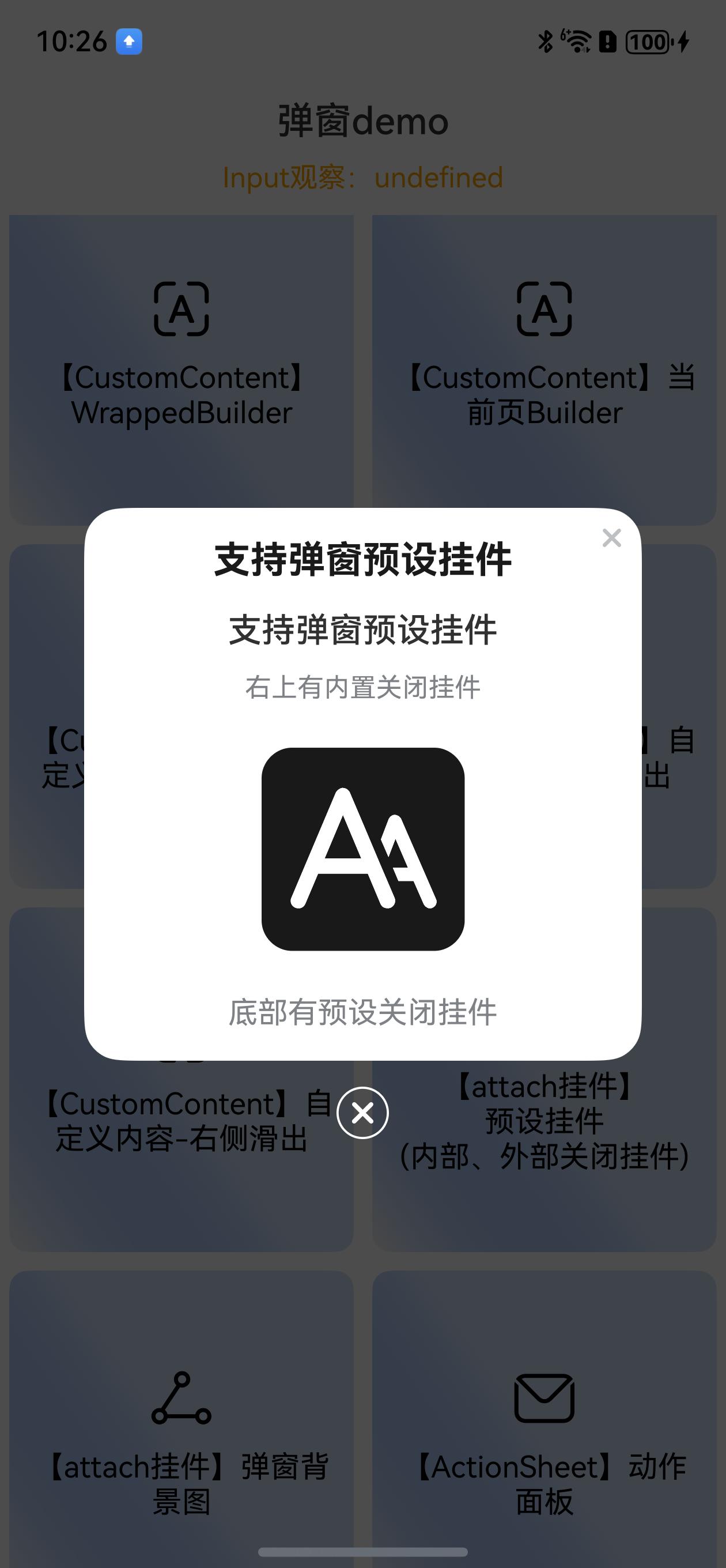
// 【attach挂件】自定义内容结合\n预设挂件\n(内部、外部关闭挂件)
DialogHub.getCustom()
.autoCancel(false)
.title('支持弹窗预设挂件')
.customContent(() => {
this.customContentDemoBuilder()//详细见entry示例
})
.attaches([PresetAttach.outsideBottomCenterClose, PresetAttach.insideTopRightClose], (i) => {
this.toast(`点击了第${i}个挂件`)
})
.build()
.show()
```
```ts
// 【attach挂件】自定义内容-底部滑出
DialogHub.getCustom()
.alignment(DialogAlignment.Bottom)
.customContent(() => {
this.customContentDemo1Builder()
})
.style({
borderRadius: { topLeft: 20, topRight: 20 },
width: '100%',
padding: 0
})
.buttons([
{
fontColor: '#FF191F25',
fontSize: 17,
value: '取消',
},
{
fontColor: '#50AB00',
fontSize: 17,
value: '确认',
}
])
.onAction((index: number) => {
this.toast(`点击了第${index}个按钮`)
})
.build({
keyboardAvoidDistance: LengthMetrics.vp(0)// 消除软键盘把弹窗顶起中间的空白区域
})
.show()
```
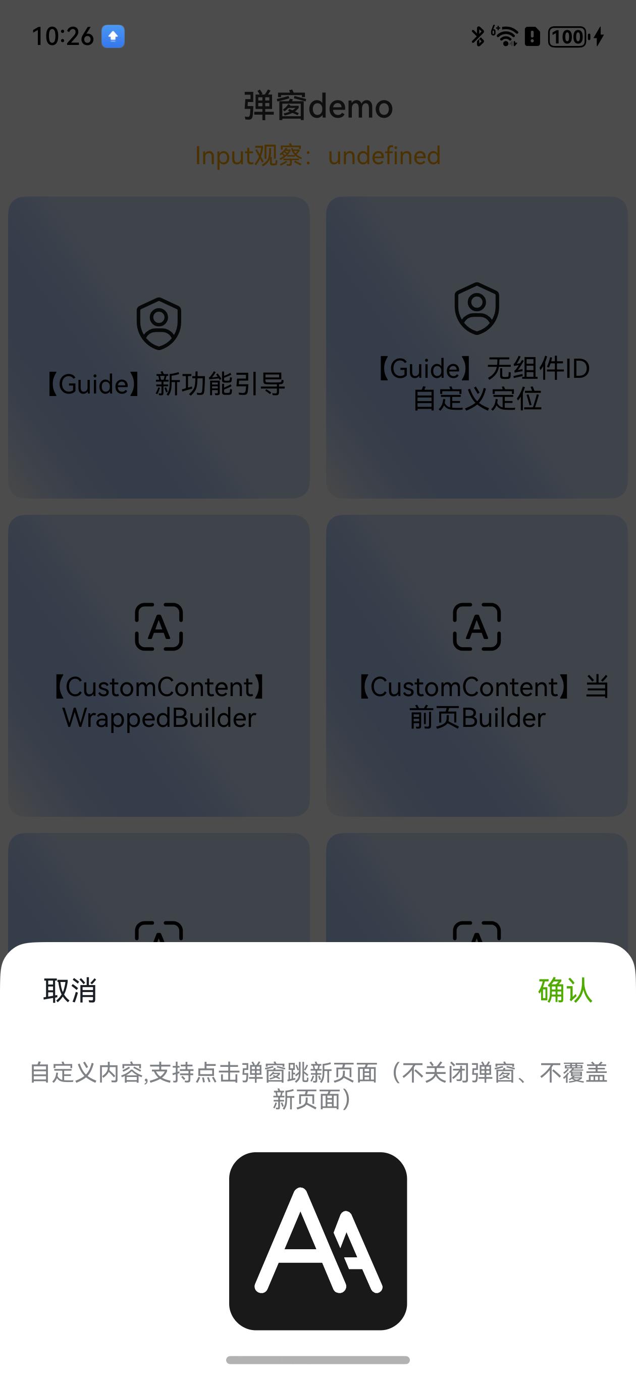
| 底部滑出 | 输入消除安全区域 |
|:--------------------------------------------------------------------------------------------------------------------------------------------------------|:--------------------------------------------------------------------------------------------------------------------------------------------------------|
| | |
```ts
//【CustomContent】自定义内容-右侧滑出
DialogHub.getCustom()
.alignment(DialogAlignment.CenterEnd)
.customContent(() => {
this.customContentDemo1Builder(true)//详细见entry示例
})
.style({
borderRadius: { topLeft: 20, bottomLeft: 20 },
height: '100%',
width: '300lpx', //注意⚠️:已在main_pages.json设置基准 designWidth:375
padding: {
top: 50,
bottom: 20,
right: 20,
left: 20
},
})
.buttons([
{
fontColor: '#FF191F25',
fontSize: 17,
value: '取消',
},
{
fontColor: '#50AB00',
fontSize: 17,
value: '确认',
}
])
.onAction((index: number) => {
this.toast(`点击了第${index}个按钮`)
})
.build()
.show()
```
自定义内容+右侧滑出弹窗效果:
```ts
// 【attach挂件】自定义内容结合\n预设挂件\n(内部、外部关闭挂件)
DialogHub.getCustom()
.autoCancel(false)
.title('支持弹窗预设挂件')
.customContent(() => {
this.customContentDemoBuilder()//详细见entry示例
})
.attaches([PresetAttach.outsideBottomCenterClose, PresetAttach.insideTopRightClose], (i) => {
this.toast(`点击了第${i}个挂件`)
})
.build()
.show()
```
```ts
// 【attach挂件】自定义内容-底部滑出
DialogHub.getCustom()
.alignment(DialogAlignment.Bottom)
.customContent(() => {
this.customContentDemo1Builder()
})
.style({
borderRadius: { topLeft: 20, topRight: 20 },
width: '100%',
padding: 0
})
.buttons([
{
fontColor: '#FF191F25',
fontSize: 17,
value: '取消',
},
{
fontColor: '#50AB00',
fontSize: 17,
value: '确认',
}
])
.onAction((index: number) => {
this.toast(`点击了第${index}个按钮`)
})
.build({
keyboardAvoidDistance: LengthMetrics.vp(0)// 消除软键盘把弹窗顶起中间的空白区域
})
.show()
```
| 底部滑出 | 输入消除安全区域 |
|:--------------------------------------------------------------------------------------------------------------------------------------------------------|:--------------------------------------------------------------------------------------------------------------------------------------------------------|
| | |
```ts
//【CustomContent】自定义内容-右侧滑出
DialogHub.getCustom()
.alignment(DialogAlignment.CenterEnd)
.customContent(() => {
this.customContentDemo1Builder(true)//详细见entry示例
})
.style({
borderRadius: { topLeft: 20, bottomLeft: 20 },
height: '100%',
width: '300lpx', //注意⚠️:已在main_pages.json设置基准 designWidth:375
padding: {
top: 50,
bottom: 20,
right: 20,
left: 20
},
})
.buttons([
{
fontColor: '#FF191F25',
fontSize: 17,
value: '取消',
},
{
fontColor: '#50AB00',
fontSize: 17,
value: '确认',
}
])
.onAction((index: number) => {
this.toast(`点击了第${index}个按钮`)
})
.build()
.show()
```
自定义内容+右侧滑出弹窗效果:
 ```ts
//【attach挂件】\n预设挂件\n(内部、外部关闭挂件)
DialogHub.getCustom()
.autoCancel(false)
.title('支持弹窗预设挂件')
.customContent(() => {
this.customContentDemoBuilder()//详细见entry示例
})
.attaches([PresetAttach.outsideBottomCenterClose, PresetAttach.insideTopRightClose], (i) => {
this.toast(`点击了第${i}个挂件`)
})
.build()
.show()
```
预设挂件+自定义内容弹窗效果(关闭挂件):
```ts
//【attach挂件】\n预设挂件\n(内部、外部关闭挂件)
DialogHub.getCustom()
.autoCancel(false)
.title('支持弹窗预设挂件')
.customContent(() => {
this.customContentDemoBuilder()//详细见entry示例
})
.attaches([PresetAttach.outsideBottomCenterClose, PresetAttach.insideTopRightClose], (i) => {
this.toast(`点击了第${i}个挂件`)
})
.build()
.show()
```
预设挂件+自定义内容弹窗效果(关闭挂件):
 ```ts
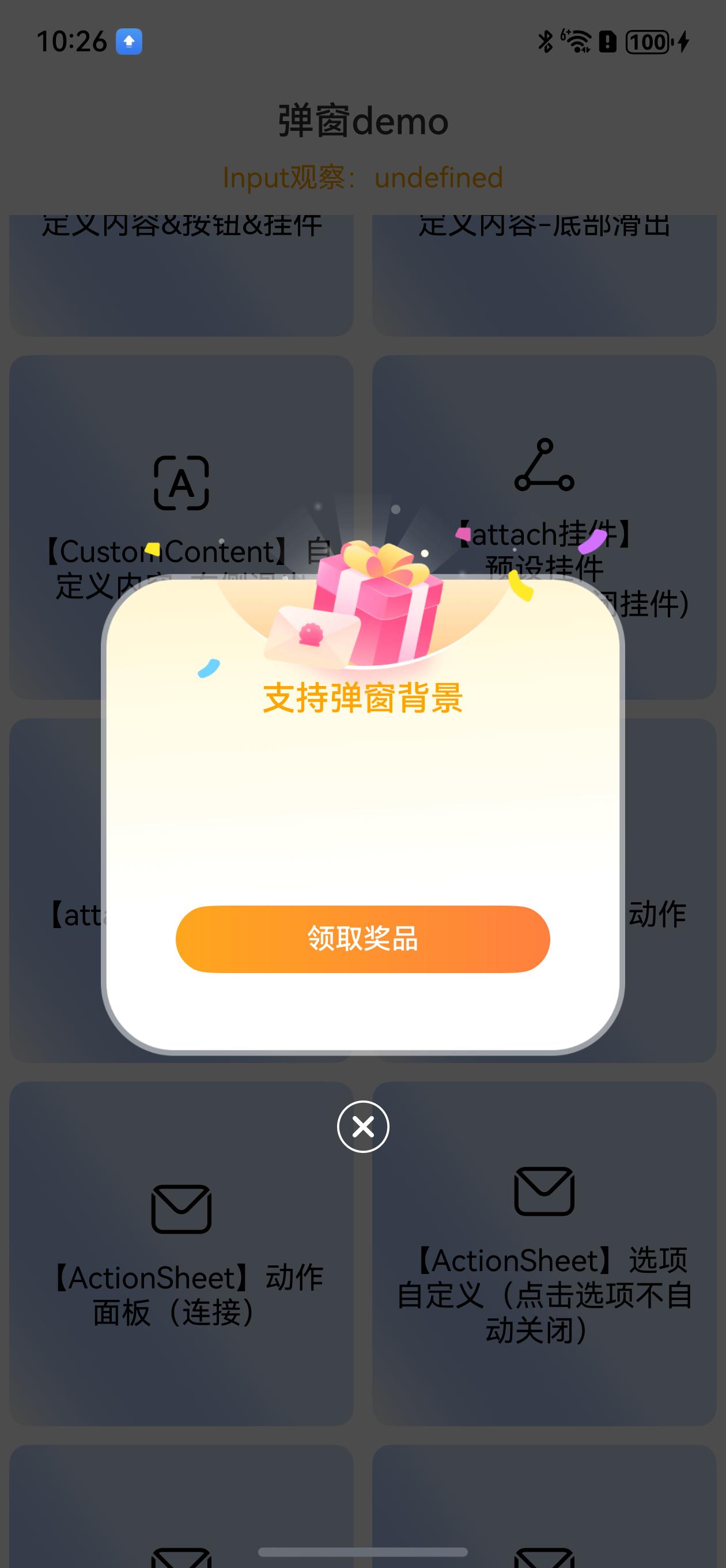
//【attach挂件】弹窗背景图
DialogHub.getCustom()
.style({
width: 280,
height: 310,
padding: { top: 100 },
customHeader: {
fontColor: Color.Orange,
margin: { bottom: 100 },
}
})
.autoCancel(false)
.title('支持弹窗背景')
.buttons([{
customStyleId: "confirmYellowLinearGradient1Btn",
value: '领取奖品'
}])
.backgroundImage($r("app.media.dialog_bg"))
.attaches([PresetAttach.outsideBottomCenterClose], (i) => {
this.toast(`点击了第${i}个挂件`)
})
.build()
.show()
```
背景图弹窗效果:
```ts
//【attach挂件】弹窗背景图
DialogHub.getCustom()
.style({
width: 280,
height: 310,
padding: { top: 100 },
customHeader: {
fontColor: Color.Orange,
margin: { bottom: 100 },
}
})
.autoCancel(false)
.title('支持弹窗背景')
.buttons([{
customStyleId: "confirmYellowLinearGradient1Btn",
value: '领取奖品'
}])
.backgroundImage($r("app.media.dialog_bg"))
.attaches([PresetAttach.outsideBottomCenterClose], (i) => {
this.toast(`点击了第${i}个挂件`)
})
.build()
.show()
```
背景图弹窗效果:
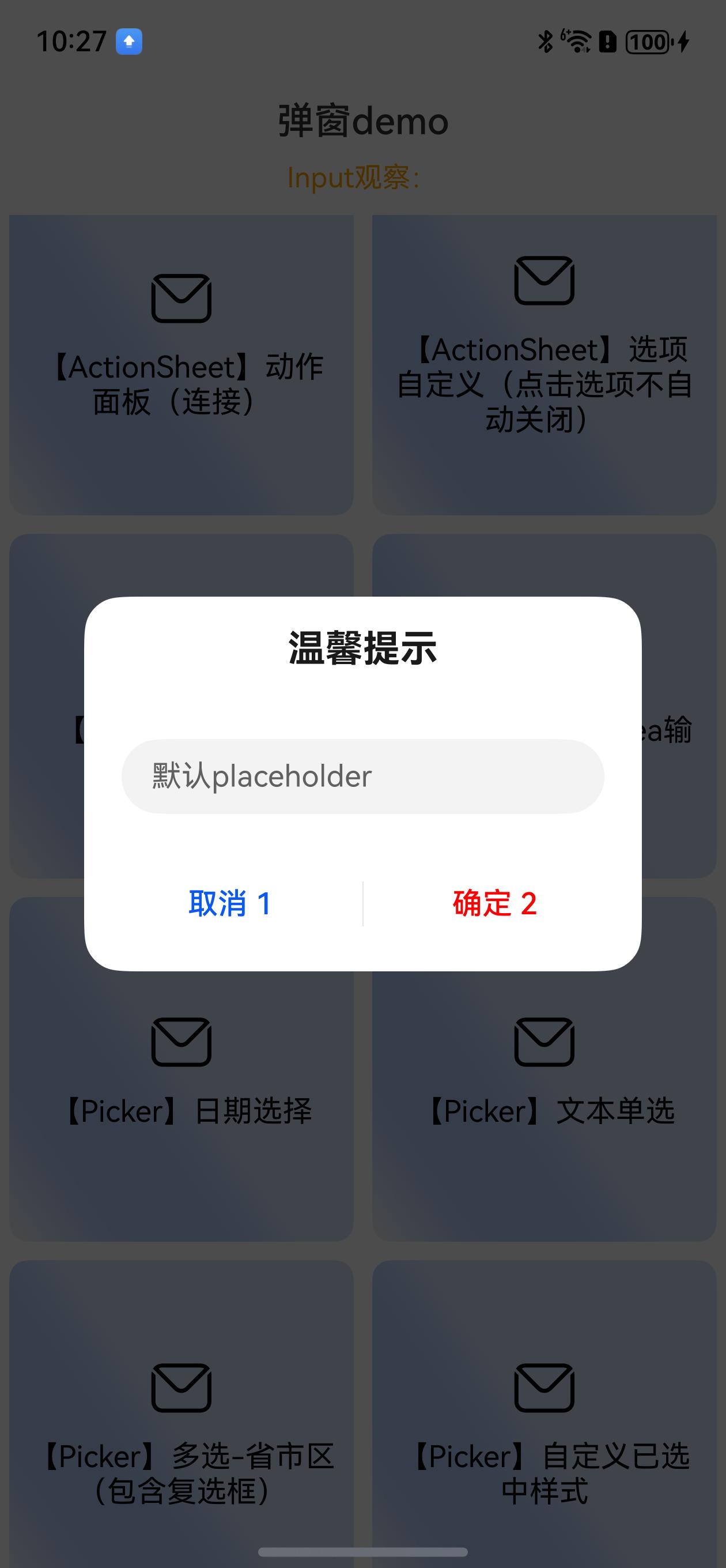
 ```ts
//【Input】文本输入 + observed
const inputObservedData = new InputObserved()
this.observeData = inputObservedData //绑定到页面Local
DialogHub.getTextInput()
.observedData(inputObservedData)
.placeholder('默认placeholder')
.onAction((action: number, dialogId: string, value: string) => {
this.toast(`输入:${value}`)
})
.buttons(["取消 1", { value: '确定 2', fontColor: Color.Red }])
.build()
.show()
```
文本输入弹窗效果:
```ts
//【Input】文本输入 + observed
const inputObservedData = new InputObserved()
this.observeData = inputObservedData //绑定到页面Local
DialogHub.getTextInput()
.observedData(inputObservedData)
.placeholder('默认placeholder')
.onAction((action: number, dialogId: string, value: string) => {
this.toast(`输入:${value}`)
})
.buttons(["取消 1", { value: '确定 2', fontColor: Color.Red }])
.build()
.show()
```
文本输入弹窗效果:
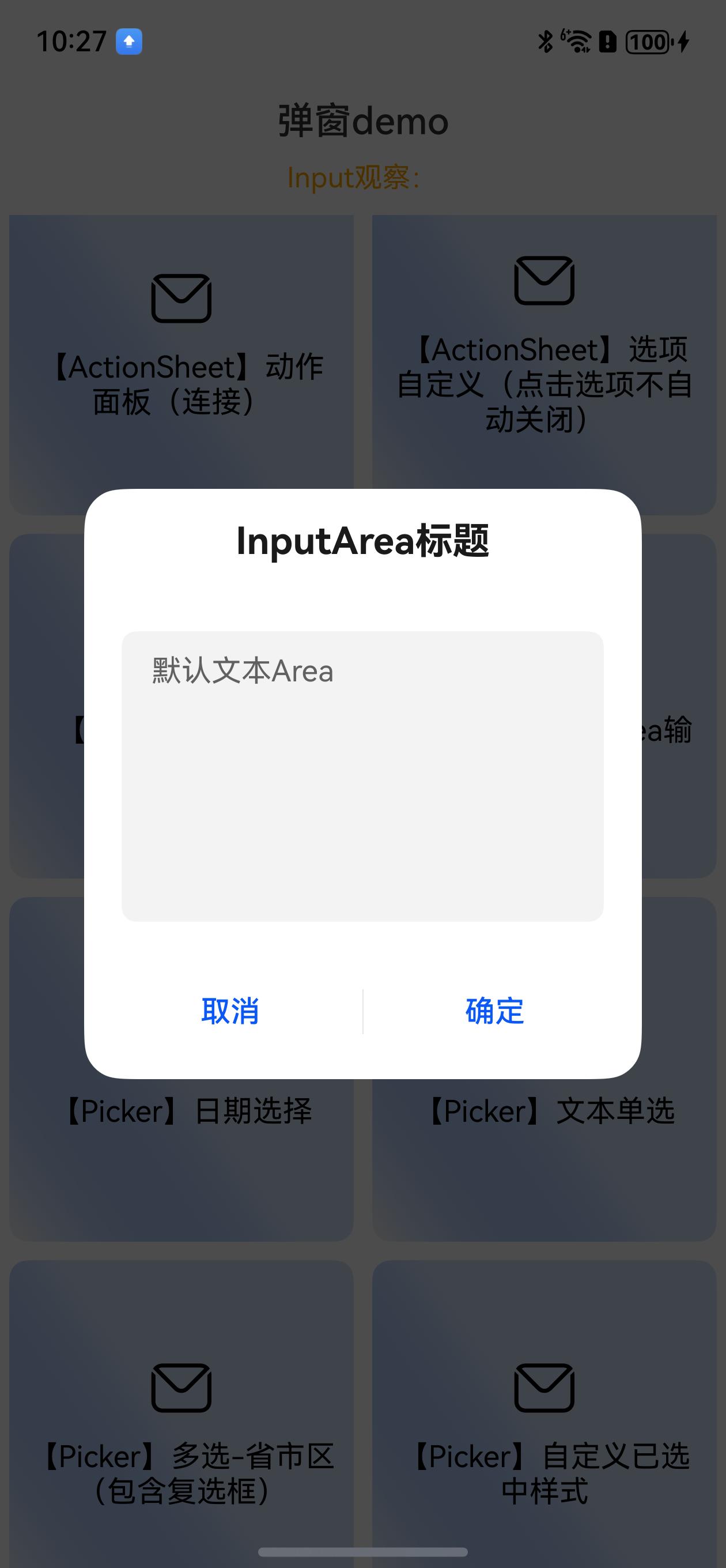
 ```ts
//【Input】InputArea输入
DialogHub.getTextArea()
.title('InputArea标题')
.placeholder('默认文本Area')
.onAction((action: number, dialogId: string, value: string) => {
this.toast(`输入:${value}`)
})
.build()
.show()
```
TextArea弹窗效果:
```ts
//【Input】InputArea输入
DialogHub.getTextArea()
.title('InputArea标题')
.placeholder('默认文本Area')
.onAction((action: number, dialogId: string, value: string) => {
this.toast(`输入:${value}`)
})
.build()
.show()
```
TextArea弹窗效果:
 ```ts
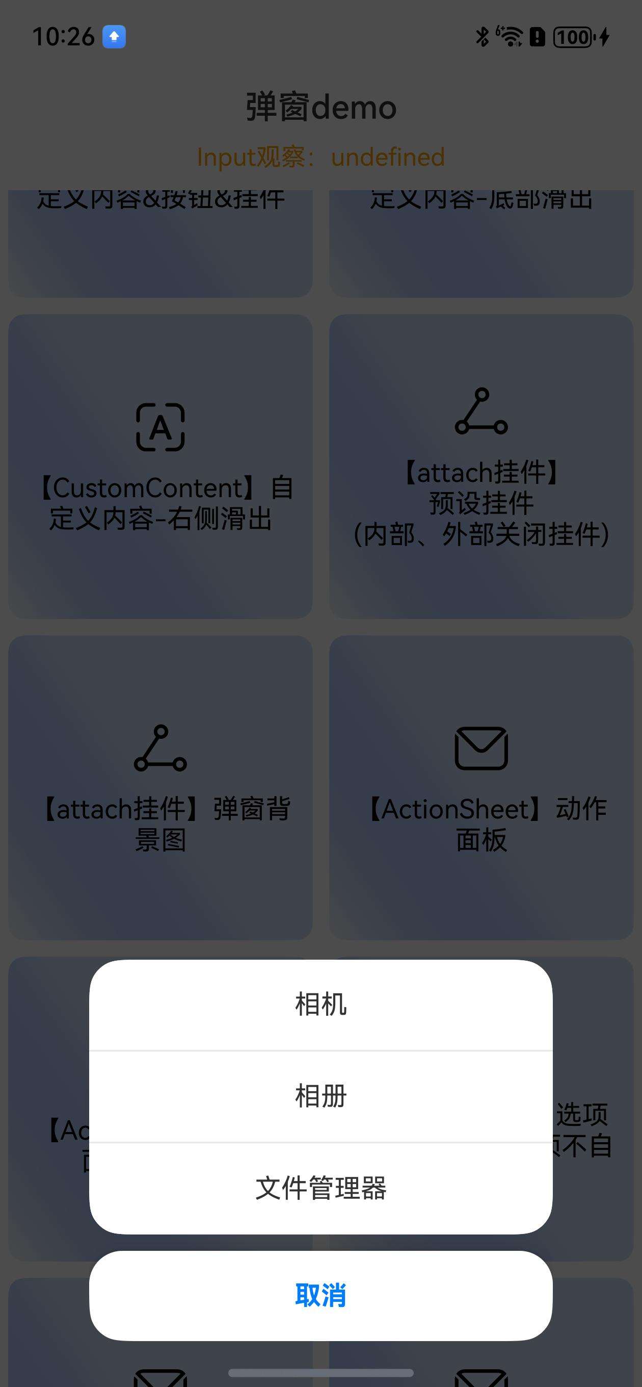
//【ActionSheet】动作面板 iOS风格 (可定制分离或拼接)
DialogHub.getActionSheet(["相机", "相册", "文件管理器"])
.isSeparateBottom(true)
.onAction((index) => {
this.toast(`点击了第${index}个按钮`)
})
.build()
.show()
```
iOS+Action图弹窗效果:
```ts
//【ActionSheet】动作面板 iOS风格 (可定制分离或拼接)
DialogHub.getActionSheet(["相机", "相册", "文件管理器"])
.isSeparateBottom(true)
.onAction((index) => {
this.toast(`点击了第${index}个按钮`)
})
.build()
.show()
```
iOS+Action图弹窗效果:
 ```ts
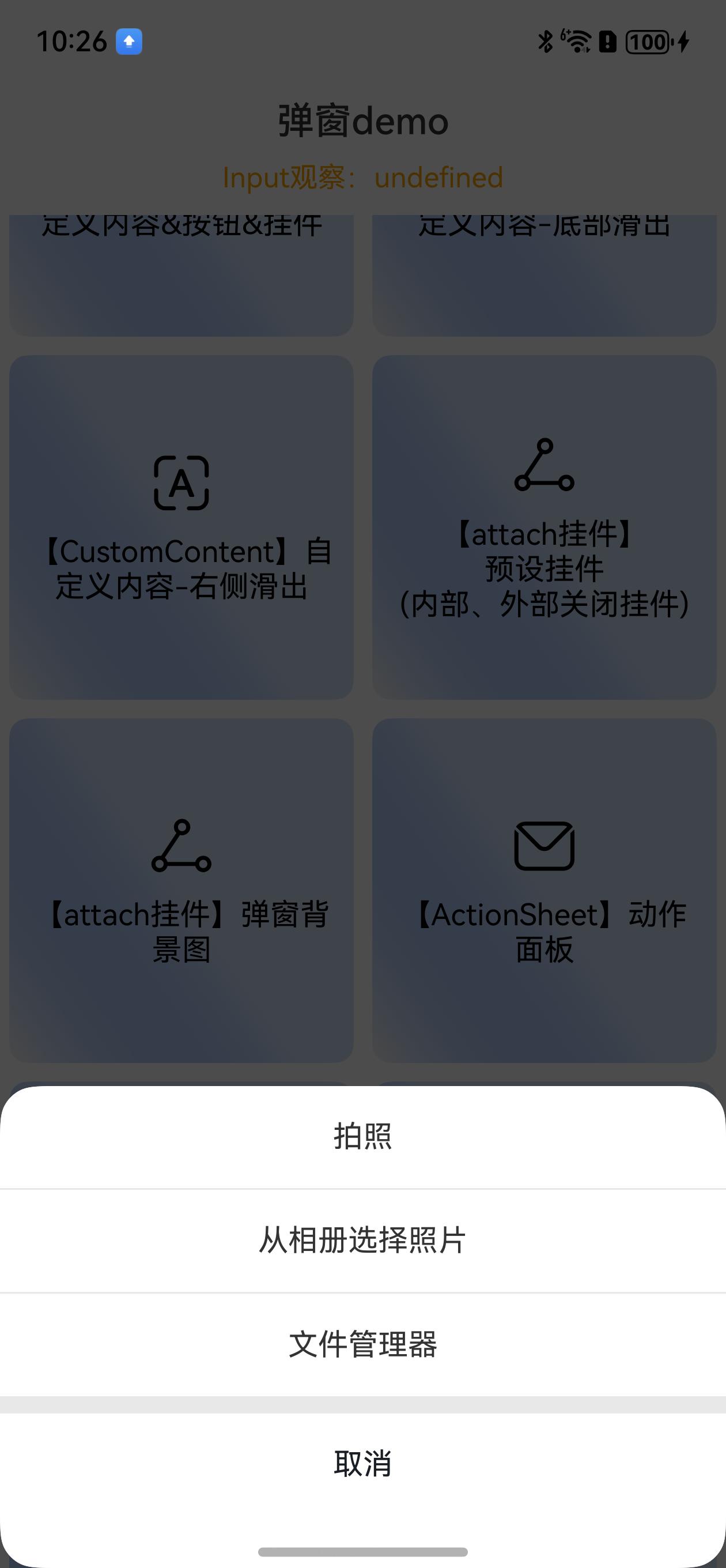
//【ActionSheet】动作面板 宽度100%
DialogHub.getActionSheet(["拍照", "从相册选择照片", "文件管理器"])
.isSeparateBottom(false)
.isFullWidth(true)
.style({
cancelFontColor: '#191F25',
cancelFontWeight: FontWeight.Regular
})
.onAction((index) => {
this.toast(`点击了第${index}个按钮`)
})
.onDidDisappear((reason) => {
if (reason === CloseReason.ACTION) {
console.log('点击action')
} else {
console.log('点击取消、遮罩等')
}
})
.build()
.show()
```
ActionSheet+100%宽度弹窗效果:
```ts
//【ActionSheet】动作面板 宽度100%
DialogHub.getActionSheet(["拍照", "从相册选择照片", "文件管理器"])
.isSeparateBottom(false)
.isFullWidth(true)
.style({
cancelFontColor: '#191F25',
cancelFontWeight: FontWeight.Regular
})
.onAction((index) => {
this.toast(`点击了第${index}个按钮`)
})
.onDidDisappear((reason) => {
if (reason === CloseReason.ACTION) {
console.log('点击action')
} else {
console.log('点击取消、遮罩等')
}
})
.build()
.show()
```
ActionSheet+100%宽度弹窗效果:
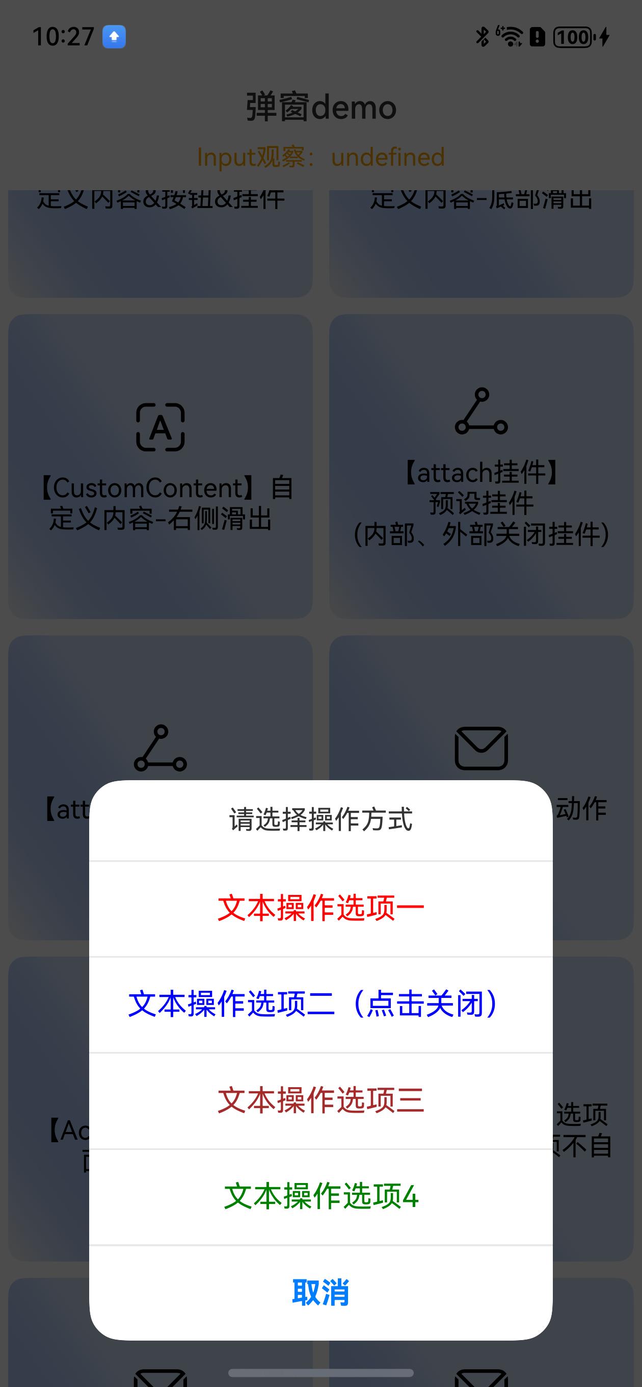
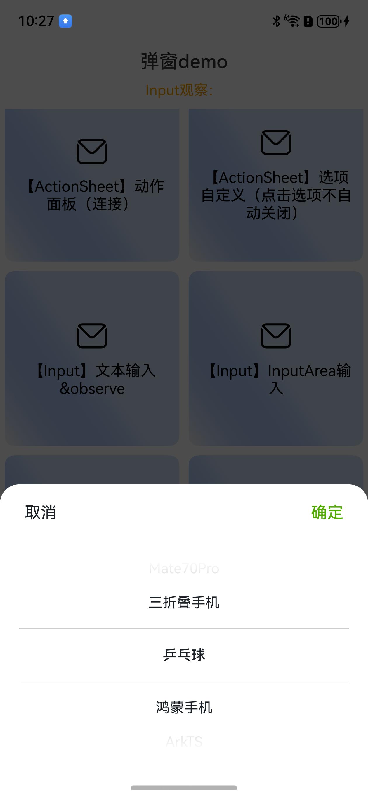
 ```ts
//【ActionSheet】选项自定义(点击选项不自动关闭)
DialogHub.getActionSheet([{
value: "文本操作选项一",
fontColor: Color.Red,
fontSize: 18
}, {
value: "文本操作选项二(点击关闭)",
fontColor: Color.Blue,
fontSize: 18
}, {
value: "文本操作选项三",
fontColor: Color.Brown,
fontSize: 18
}, {
value: "文本操作选项4",
fontColor: Color.Green,
fontSize: 18
}])
.actionCancel(false)
.title('请选择操作方式')
.isSeparateBottom(false)
.onAction((index) => {
this.toast(`点击了第${index}个按钮`)
if (index === 1) {
DialogHub.closeDialog()
}
})
.build()
.show()
```
Action菜单弹窗效果:
```ts
//【ActionSheet】选项自定义(点击选项不自动关闭)
DialogHub.getActionSheet([{
value: "文本操作选项一",
fontColor: Color.Red,
fontSize: 18
}, {
value: "文本操作选项二(点击关闭)",
fontColor: Color.Blue,
fontSize: 18
}, {
value: "文本操作选项三",
fontColor: Color.Brown,
fontSize: 18
}, {
value: "文本操作选项4",
fontColor: Color.Green,
fontSize: 18
}])
.actionCancel(false)
.title('请选择操作方式')
.isSeparateBottom(false)
.onAction((index) => {
this.toast(`点击了第${index}个按钮`)
if (index === 1) {
DialogHub.closeDialog()
}
})
.build()
.show()
```
Action菜单弹窗效果:
 ```ts
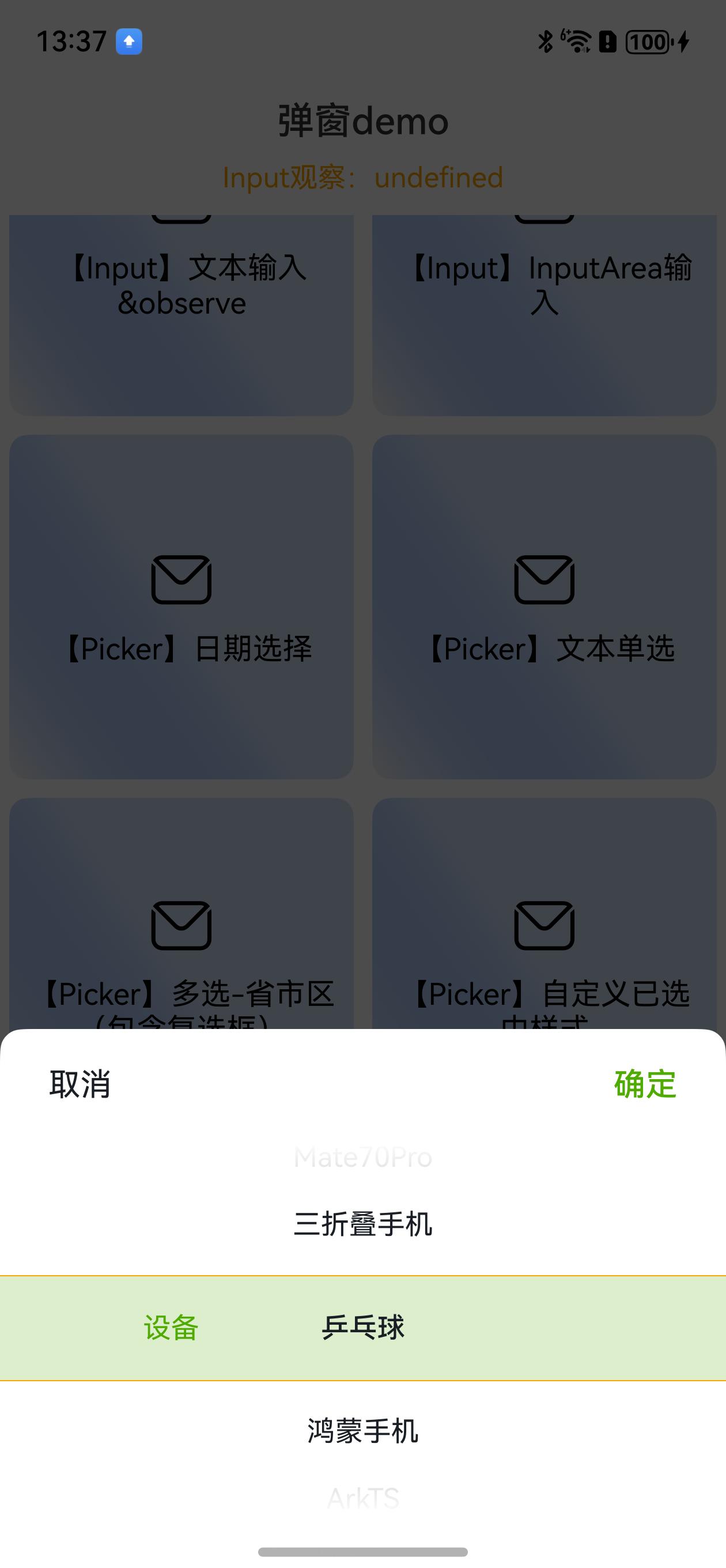
//【Picker】文本单选
DialogHub.getTextPicker()
.range(['乒乓球', '鸿蒙手机', 'ArkTS', 'Mate70Pro', '三折叠手机',])
.style({
pickerPadding: 20
})
.buttons({
value: '取消',
fontColor: '#FF191F25',
fontSize: 17,
}, {
value: "确定",
fontColor: '#50AB00',
fontSize: 17,
})
.canLoop(true)
.onAction((action: number, dialogId: string, value: string | string[]) => {
if (action == DialogAction.SURE) {
this.toast(`点击${value as string}`)
}
})
.build()
.show()
```
文本单选+自定义按钮样式弹窗效果:
```ts
//【Picker】文本单选
DialogHub.getTextPicker()
.range(['乒乓球', '鸿蒙手机', 'ArkTS', 'Mate70Pro', '三折叠手机',])
.style({
pickerPadding: 20
})
.buttons({
value: '取消',
fontColor: '#FF191F25',
fontSize: 17,
}, {
value: "确定",
fontColor: '#50AB00',
fontSize: 17,
})
.canLoop(true)
.onAction((action: number, dialogId: string, value: string | string[]) => {
if (action == DialogAction.SURE) {
this.toast(`点击${value as string}`)
}
})
.build()
.show()
```
文本单选+自定义按钮样式弹窗效果:
 ```ts
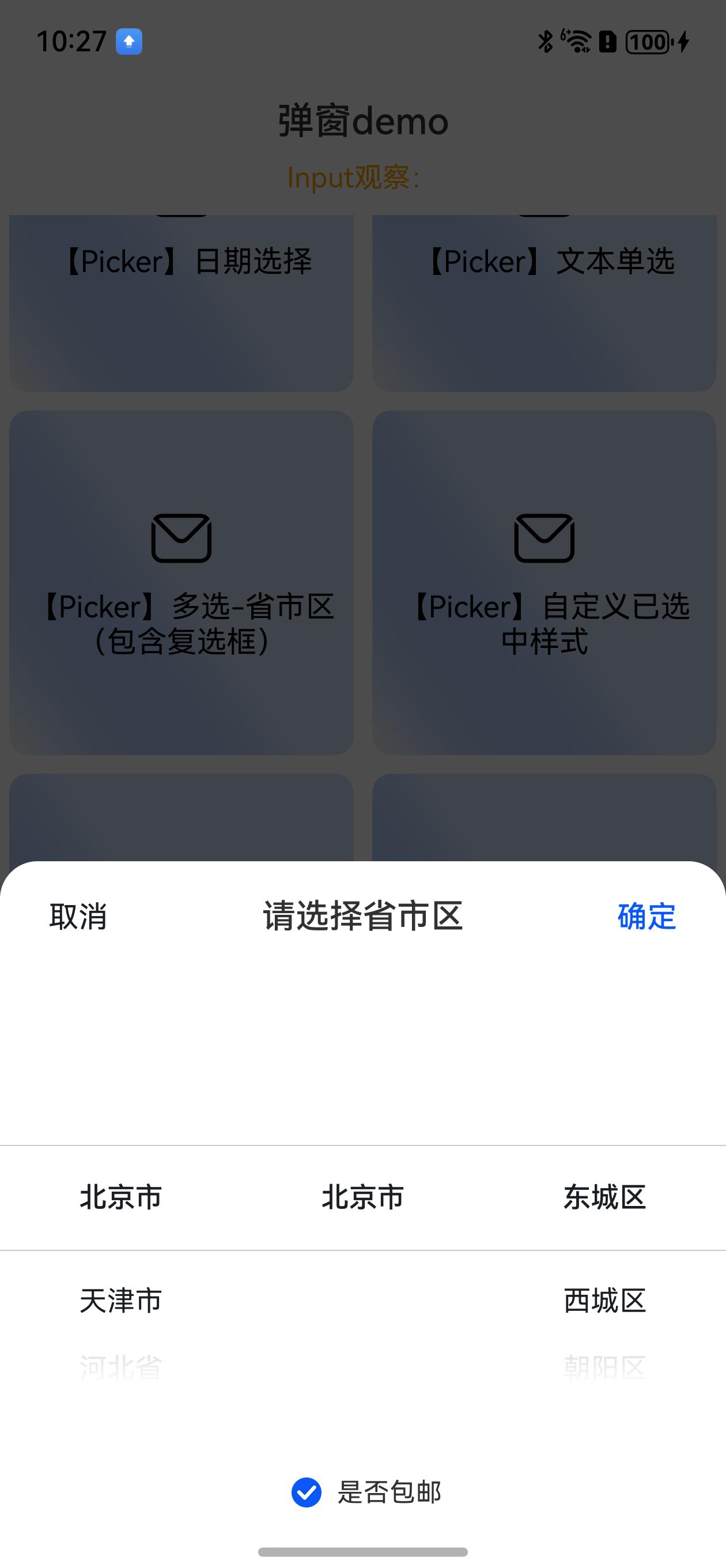
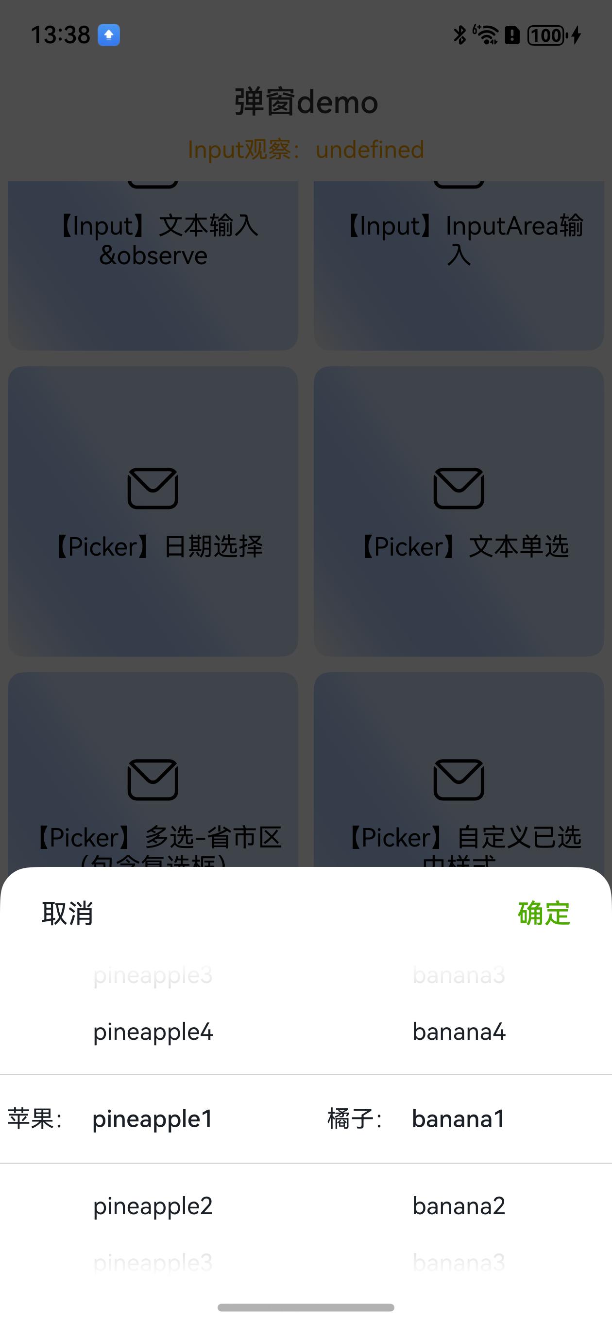
// 【Picker】多选-省市区\n(包含复选框)
let areas = AreaHelper.getAreaSync();
DialogHub.getTextPicker()
.range(areas)
.style({
pickerMargin: {
// 前后间距
top: 20,
bottom: 20
},
})
.title('请选择省市区')
.check({
isChecked: true,
checkTips: '是否包邮',
onCheckedChange: (checked: boolean) => {
this.toast(`勾选:${checked}`
)
},
// style: {
// fontColor: Color.Orange,
// // selectedColor: Color.Green,
// shape: CheckBoxShape.ROUNDED_SQUARE,
// size: 30
// }
})
.onAction((action: number, dialogId: string, value: string | string[], checked?: boolean) => {
if (action == DialogAction.SURE) {
this.toast(`点击${value as string}-checked:${checked}`)
}
})
.build()
.show()
```
多选项弹窗效果:
```ts
// 【Picker】多选-省市区\n(包含复选框)
let areas = AreaHelper.getAreaSync();
DialogHub.getTextPicker()
.range(areas)
.style({
pickerMargin: {
// 前后间距
top: 20,
bottom: 20
},
})
.title('请选择省市区')
.check({
isChecked: true,
checkTips: '是否包邮',
onCheckedChange: (checked: boolean) => {
this.toast(`勾选:${checked}`
)
},
// style: {
// fontColor: Color.Orange,
// // selectedColor: Color.Green,
// shape: CheckBoxShape.ROUNDED_SQUARE,
// size: 30
// }
})
.onAction((action: number, dialogId: string, value: string | string[], checked?: boolean) => {
if (action == DialogAction.SURE) {
this.toast(`点击${value as string}-checked:${checked}`)
}
})
.build()
.show()
```
多选项弹窗效果:
 ```ts
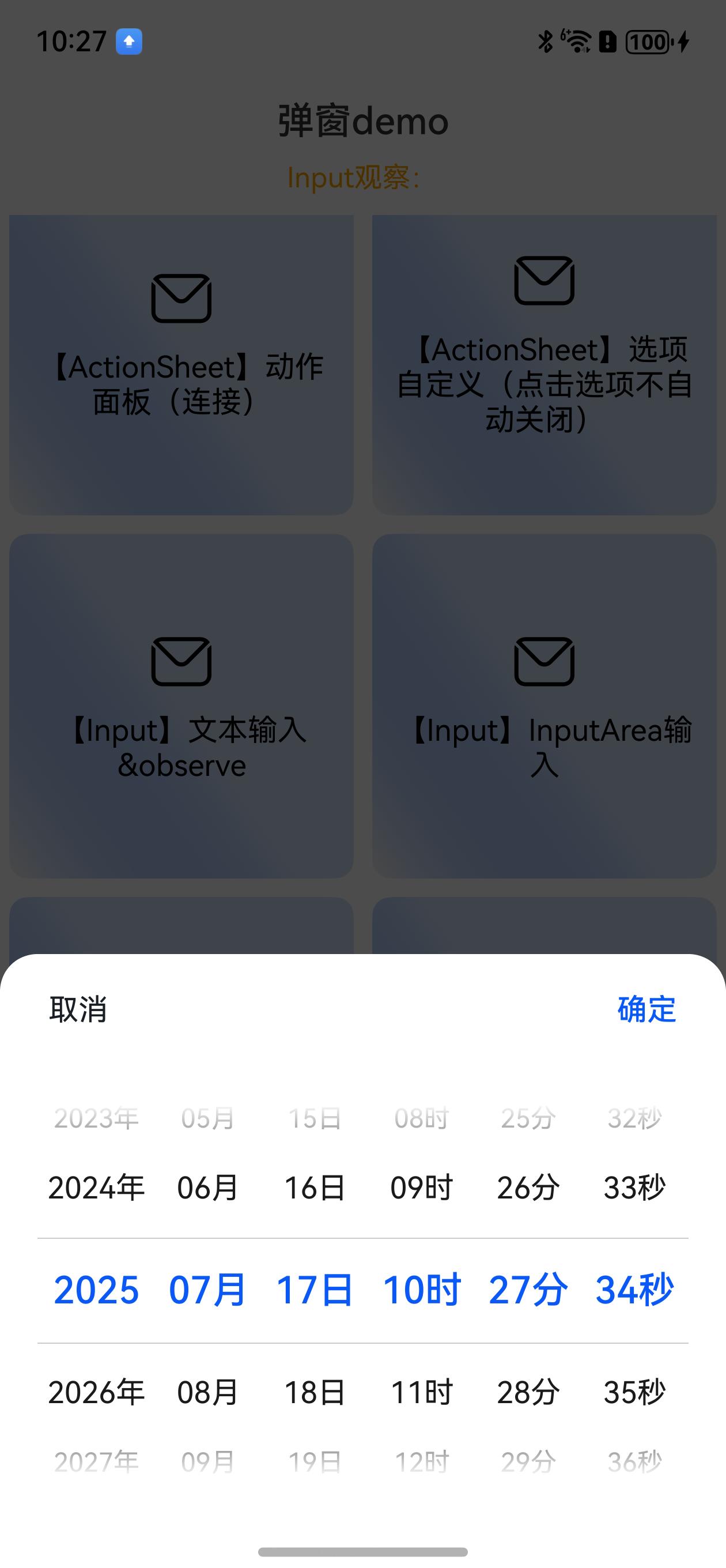
//【Picker】日期选择
DialogHub.getDatePicker()
.style({
pickerPadding: 20
})
.dateType(DateType.YmdHms)
.onAction((action: number, dialogId: string, date: Date) => {
this.toast(`点击${date.toDateString()}`)
})
.build()
.show()
```
日期选择弹窗效果:
```ts
//【Picker】日期选择
DialogHub.getDatePicker()
.style({
pickerPadding: 20
})
.dateType(DateType.YmdHms)
.onAction((action: number, dialogId: string, date: Date) => {
this.toast(`点击${date.toDateString()}`)
})
.build()
.show()
```
日期选择弹窗效果:
 ```ts
// 【Picker】自定义已选中样式
DialogHub.getTextPicker()
.range(['乒乓球', '鸿蒙手机', 'ArkTS', 'Mate70Pro', '三折叠手机',])
.style({
// headerBackground: "#FFFFFF",
backgroundColor: '#FFFFFF',
selectedFixTextStyle: {
color: '#50AB00',
marginText: 50, //与右侧选项间距,以最长选项为准
},
selectedStyle: {
backgroundColor: '#3350ab00'
},
divider: {
color: Color.Orange//$r('app.color.border_line2')
},
textStyle: {
color: '#191F25',
fontSize: 15
},
selectedTextStyle: {
color: '#191F25',
fontSize: 15
},
disappearTextStyle: {
color: '#47191F25',
fontSize: 15
},
borderRadius: 12
})
.buttons({
value: '取消',
fontColor: '#FF191F25',
fontSize: 17,
}, {
value: "确定",
fontColor: '#50AB00',
fontSize: 17,
})
.selectedLeftText('设备')//固定左侧标题
// .selectedRightText('- 设备右')//可把固定放于右侧
.canLoop(true)
.onAction((action: number, dialogId: string, value: string | string[]) => {
if (action == DialogAction.SURE) {
this.toast(`点击${value as string}`)
}
})
.build()
.show()
```
选择自定义样式弹窗效果:
```ts
// 【Picker】自定义已选中样式
DialogHub.getTextPicker()
.range(['乒乓球', '鸿蒙手机', 'ArkTS', 'Mate70Pro', '三折叠手机',])
.style({
// headerBackground: "#FFFFFF",
backgroundColor: '#FFFFFF',
selectedFixTextStyle: {
color: '#50AB00',
marginText: 50, //与右侧选项间距,以最长选项为准
},
selectedStyle: {
backgroundColor: '#3350ab00'
},
divider: {
color: Color.Orange//$r('app.color.border_line2')
},
textStyle: {
color: '#191F25',
fontSize: 15
},
selectedTextStyle: {
color: '#191F25',
fontSize: 15
},
disappearTextStyle: {
color: '#47191F25',
fontSize: 15
},
borderRadius: 12
})
.buttons({
value: '取消',
fontColor: '#FF191F25',
fontSize: 17,
}, {
value: "确定",
fontColor: '#50AB00',
fontSize: 17,
})
.selectedLeftText('设备')//固定左侧标题
// .selectedRightText('- 设备右')//可把固定放于右侧
.canLoop(true)
.onAction((action: number, dialogId: string, value: string | string[]) => {
if (action == DialogAction.SURE) {
this.toast(`点击${value as string}`)
}
})
.build()
.show()
```
选择自定义样式弹窗效果:
 ```ts
// 【Picker】多列左侧标题弹窗
DialogHub.getTextPicker()
.range(this.composeArray)
.style({
selectedFixTextStyle: {
marginText: 5
},
})
.buttons({
value: '取消',
fontColor: '#FF191F25',
fontSize: 17,
}, {
value: "确定",
fontColor: '#50AB00',
fontSize: 17,
})
.selectedLeftText('苹果:')
.selectedRightText('橘子:')
.canLoop(true)
.onAction((action: number, dialogId: string, value: string | string[]) => {
if (action == DialogAction.SURE) {
this.toast(`点击${value as string}`)
}
})
.build()
.show()
```
选择器-多列左侧标题弹窗效果:
```ts
// 【Picker】多列左侧标题弹窗
DialogHub.getTextPicker()
.range(this.composeArray)
.style({
selectedFixTextStyle: {
marginText: 5
},
})
.buttons({
value: '取消',
fontColor: '#FF191F25',
fontSize: 17,
}, {
value: "确定",
fontColor: '#50AB00',
fontSize: 17,
})
.selectedLeftText('苹果:')
.selectedRightText('橘子:')
.canLoop(true)
.onAction((action: number, dialogId: string, value: string | string[]) => {
if (action == DialogAction.SURE) {
this.toast(`点击${value as string}`)
}
})
.build()
.show()
```
选择器-多列左侧标题弹窗效果:
 ```ts
//【Image】纯图弹窗(默认 图片下方带关闭按钮,按钮可隐藏) 在线图将下载完成后展示
// DialogHub.getImage($r('sys.media.ohos_ic_normal_white_grid_image')) //本地图片
DialogHub.getImage('https://iot.babybus.com/BookPoint/BookPic/20250114/13d601e24e7b41149dae55e70a536d1d.png')//网络图片
.onAction(() => {
this.toast('点击图片')
})
// .isShowClose(false)//默认显示关闭按钮,可隐藏
.build()
.show()
```
纯图弹窗效果(支持本地图、在线图-在线图将下载完成后展示):
```ts
//【Image】纯图弹窗(默认 图片下方带关闭按钮,按钮可隐藏) 在线图将下载完成后展示
// DialogHub.getImage($r('sys.media.ohos_ic_normal_white_grid_image')) //本地图片
DialogHub.getImage('https://iot.babybus.com/BookPoint/BookPic/20250114/13d601e24e7b41149dae55e70a536d1d.png')//网络图片
.onAction(() => {
this.toast('点击图片')
})
// .isShowClose(false)//默认显示关闭按钮,可隐藏
.build()
.show()
```
纯图弹窗效果(支持本地图、在线图-在线图将下载完成后展示):
 ```ts
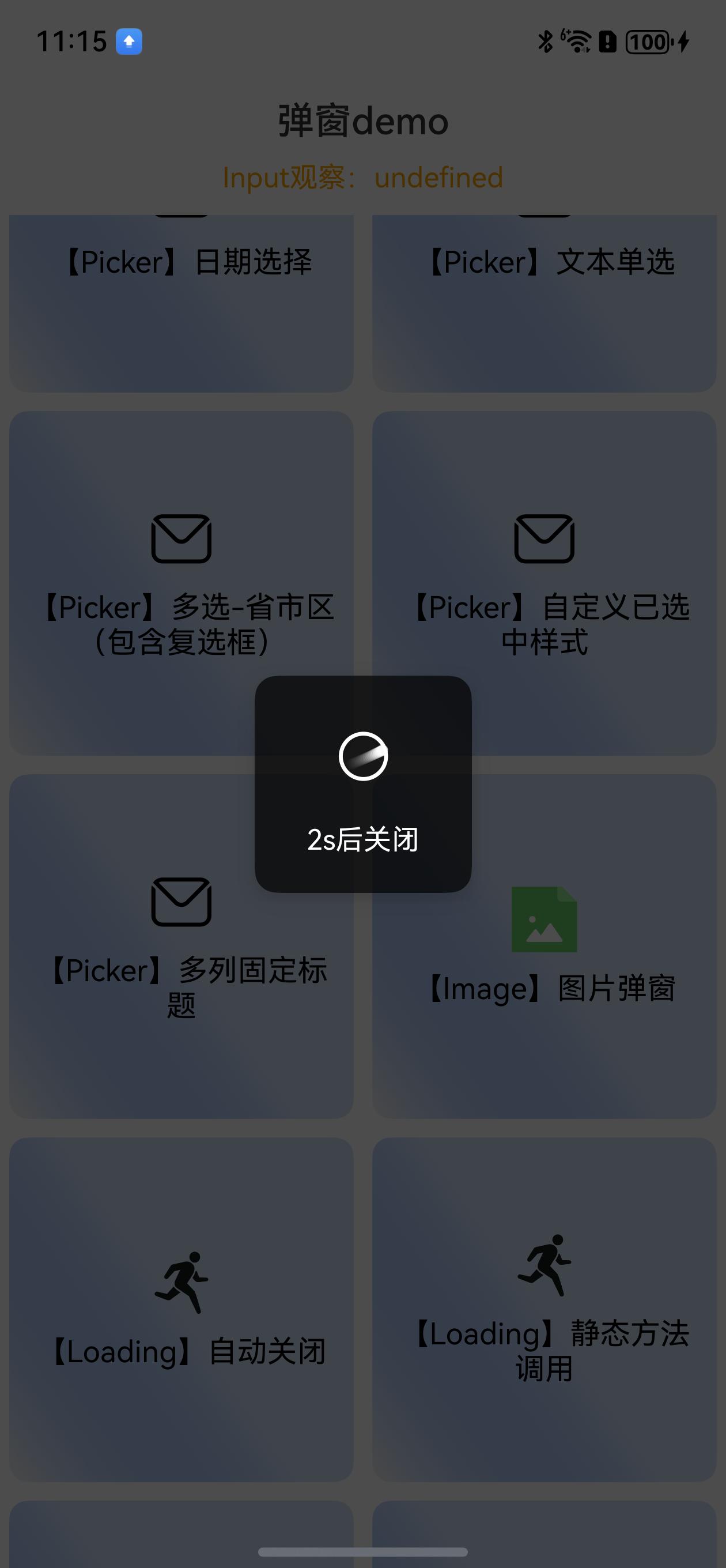
//【Loading】自动关闭
//指定弹窗ID 关闭弹窗
const customId = 'closeLoadingDemo'
DialogHub.getLoading()
.dialogId(customId)
.content('2s后关闭')
.build()
.show()
setTimeout(() => {
DialogHub.closeDialog(customId)
// DialogHub.closeDialog()
}, 2000)
```
Loading弹窗效果:
```ts
//【Loading】自动关闭
//指定弹窗ID 关闭弹窗
const customId = 'closeLoadingDemo'
DialogHub.getLoading()
.dialogId(customId)
.content('2s后关闭')
.build()
.show()
setTimeout(() => {
DialogHub.closeDialog(customId)
// DialogHub.closeDialog()
}, 2000)
```
Loading弹窗效果:
 ```ts
// 【Loading】静态方法调用
DialogHub.showLoading('静态2s关闭', 'staticLoading') // 方式 1
//DialogHub.showLoading({ content: '静态2s关闭', dialogId:'xxx' }) // 方式 2
setTimeout(() => {
DialogHub.closeDialog('staticLoading') //⚠️注意:同时多个弹窗,建议带上弹窗ID。否则,将互相影响
}, 2000)
//【Loading】内容更新\n(自定义样式)
const observedData = new LoadingObserved()
observedData.content = '初始文本'
DialogHub.getLoading()
.dialogId('changeContent')
.style({
backgroundColor: '#CCC',
textMarginTop: 20,
padding: {
left: 15,
right: 15,
top: 15,
}
})
.observedData(observedData)
.build()
.show()
setTimeout(() => {
observedData.content = '变化后文本'
setTimeout(() => {
DialogHub.closeDialog('changeContent')
}, 1000)
}, 2000)
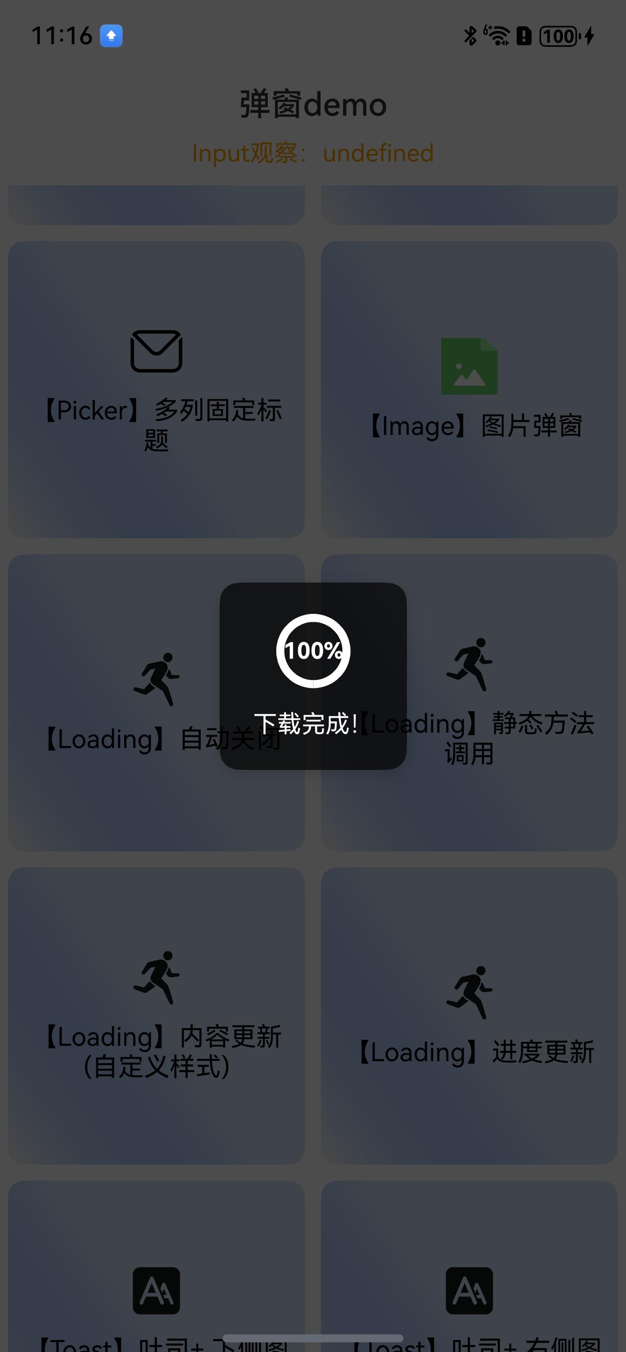
// 【Loading】进度更新
const progress = new LoadingProgressObserved()
progress.progress = 2
DialogHub.getLoadingProgress()
.dialogId('downloading')
.observedData(progress)
.content('下载中...')
.style({
progressFontSize: 14,
// progressColor: Color.Orange,
// progressStyle: {
// enableSmoothEffect: false,
// // strokeWidth: 15
// }
})
.build()
.show()
```
进度弹窗效果:
```ts
// 【Loading】静态方法调用
DialogHub.showLoading('静态2s关闭', 'staticLoading') // 方式 1
//DialogHub.showLoading({ content: '静态2s关闭', dialogId:'xxx' }) // 方式 2
setTimeout(() => {
DialogHub.closeDialog('staticLoading') //⚠️注意:同时多个弹窗,建议带上弹窗ID。否则,将互相影响
}, 2000)
//【Loading】内容更新\n(自定义样式)
const observedData = new LoadingObserved()
observedData.content = '初始文本'
DialogHub.getLoading()
.dialogId('changeContent')
.style({
backgroundColor: '#CCC',
textMarginTop: 20,
padding: {
left: 15,
right: 15,
top: 15,
}
})
.observedData(observedData)
.build()
.show()
setTimeout(() => {
observedData.content = '变化后文本'
setTimeout(() => {
DialogHub.closeDialog('changeContent')
}, 1000)
}, 2000)
// 【Loading】进度更新
const progress = new LoadingProgressObserved()
progress.progress = 2
DialogHub.getLoadingProgress()
.dialogId('downloading')
.observedData(progress)
.content('下载中...')
.style({
progressFontSize: 14,
// progressColor: Color.Orange,
// progressStyle: {
// enableSmoothEffect: false,
// // strokeWidth: 15
// }
})
.build()
.show()
```
进度弹窗效果:
 ```ts
//延迟更新进度
setTimeout(() => {
progress.progress = 50
setTimeout(() => {
progress.progress = 100
progress.content = '下载完成!'
setTimeout(() => {
DialogHub.closeDialog('downloading')
}, 1000)
}, 1000)
}, 1000)
```
```ts
//【Toast】吐司+ 下侧图标
DialogHub.getToastIcon()
.icon($r('sys.media.figure_running'))
.message('吐司内容')
.build()
.show()
```
```ts
//【Toast】吐司+ 右侧图标
DialogHub.getToastIcon()
.icon($r('sys.media.figure_running'))
.message('吐司内容')
.orientation(Orientation.HORIZONTAL)
.build()
.show()
//吐司
DialogHub.showToast('吐司内容')// 方式 1 默认样式
// 方式 2 【Toast】定制样式
DialogHub.getToast('吐司内容1')
.build({
backgroundColor: '#CCC',
duration: 2000,
})
.show()
```
```ts
//【完全自定义】使用builder可配置完整参数
DialogHub.getCustom()
.build({
style: {
backgroundColor: Color.Yellow,
},
primaryTitle: '完全自定义options',
secondaryTitle: '通过完整参数可自由定制任意弹窗\n可自行封装',
})
.show()
```
## 📧建议与反馈
```ts
//延迟更新进度
setTimeout(() => {
progress.progress = 50
setTimeout(() => {
progress.progress = 100
progress.content = '下载完成!'
setTimeout(() => {
DialogHub.closeDialog('downloading')
}, 1000)
}, 1000)
}, 1000)
```
```ts
//【Toast】吐司+ 下侧图标
DialogHub.getToastIcon()
.icon($r('sys.media.figure_running'))
.message('吐司内容')
.build()
.show()
```
```ts
//【Toast】吐司+ 右侧图标
DialogHub.getToastIcon()
.icon($r('sys.media.figure_running'))
.message('吐司内容')
.orientation(Orientation.HORIZONTAL)
.build()
.show()
//吐司
DialogHub.showToast('吐司内容')// 方式 1 默认样式
// 方式 2 【Toast】定制样式
DialogHub.getToast('吐司内容1')
.build({
backgroundColor: '#CCC',
duration: 2000,
})
.show()
```
```ts
//【完全自定义】使用builder可配置完整参数
DialogHub.getCustom()
.build({
style: {
backgroundColor: Color.Yellow,
},
primaryTitle: '完全自定义options',
secondaryTitle: '通过完整参数可自由定制任意弹窗\n可自行封装',
})
.show()
```
## 📧建议与反馈